Fig. D.2
Download original image
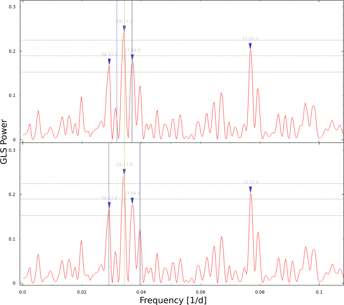
Close-up look of the RV GLS periodogram, executed with the publicly available tool Exo-Striker (Trifonov 2019; https://github.com/3fon3fonov/exostriker) after the removal of a linear trend. The two vertical blue lines, around the 29-day signal (indicated by a vertical yellow line), show the main peak aliases due to the two highest frequencies of the window function, in the upper and bottom panels. The three horizontal dotted lines represent the 10%, 1%, and 0.1% FAP levels.
Current usage metrics show cumulative count of Article Views (full-text article views including HTML views, PDF and ePub downloads, according to the available data) and Abstracts Views on Vision4Press platform.
Data correspond to usage on the plateform after 2015. The current usage metrics is available 48-96 hours after online publication and is updated daily on week days.
Initial download of the metrics may take a while.