Fig. 3
Download original image
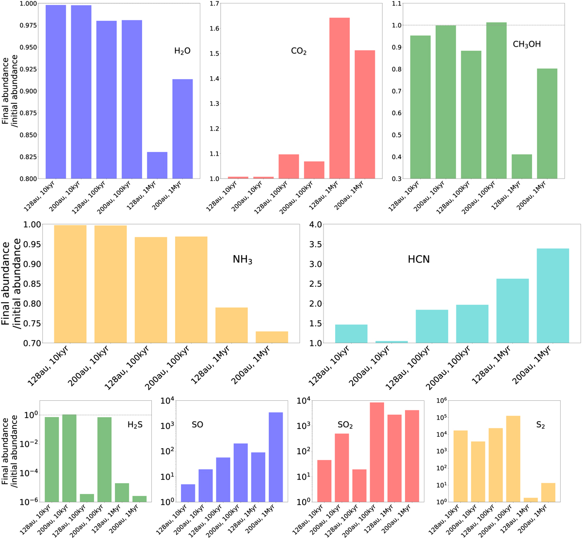
Bar plots corresponding to ratios of final abundances of different species relative to initial abundance at the onset of drifting. Initial abundances are seen in columns two and three in Table 1, and the radii at which final abundances are read out of the simulation are seen in column four in Table 1. The y-axis indicates the ratios of these values, for the six different permutations of modelling setup (on the x-axis). Drift time increases (drift becomes slower) going from left to right in each panel. We note that species which encounter their icelines further out (see Fig. 2), will experience less drifting time to change their initial abundances than will species with icelines further in. Top and middle rows have linear j/-axes, bottom row has logarithmic y-axis. We note that all y-axes feature different dynamical scales.
Current usage metrics show cumulative count of Article Views (full-text article views including HTML views, PDF and ePub downloads, according to the available data) and Abstracts Views on Vision4Press platform.
Data correspond to usage on the plateform after 2015. The current usage metrics is available 48-96 hours after online publication and is updated daily on week days.
Initial download of the metrics may take a while.