Fig. 5
Download original image
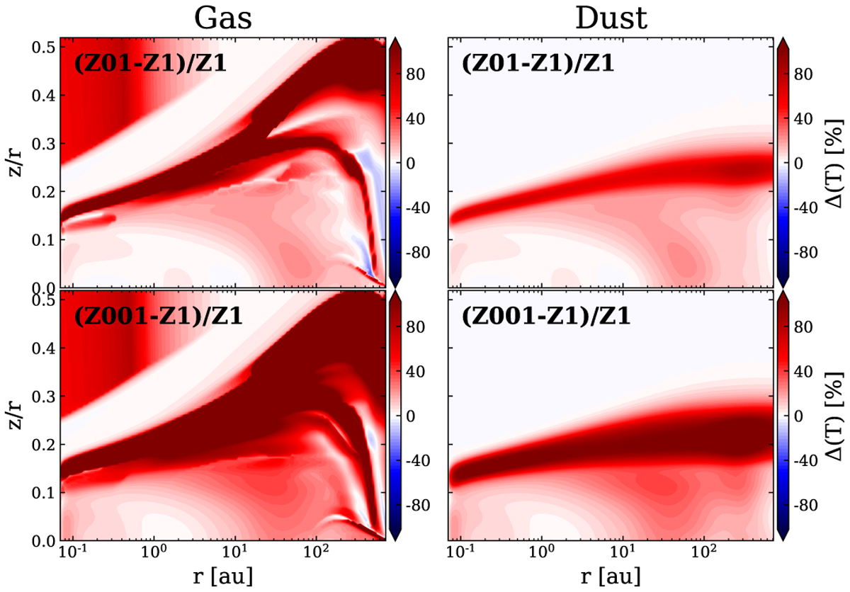
Contour plots that show the difference between the temperatures of the model Z1 and the Z01 model (top panel) and the Z001 model (bottom panel). The right-hand column shows the difference in dust temperature and the left-hand column the difference in the gas temperature. The red color represents the regions where the model with lower metallicity has a higher temperature. The white and blue colors represent the regions where both temperatures are similar and where the Z1 model has a higher temperature, respectively.
Current usage metrics show cumulative count of Article Views (full-text article views including HTML views, PDF and ePub downloads, according to the available data) and Abstracts Views on Vision4Press platform.
Data correspond to usage on the plateform after 2015. The current usage metrics is available 48-96 hours after online publication and is updated daily on week days.
Initial download of the metrics may take a while.