Fig. 8
Download original image
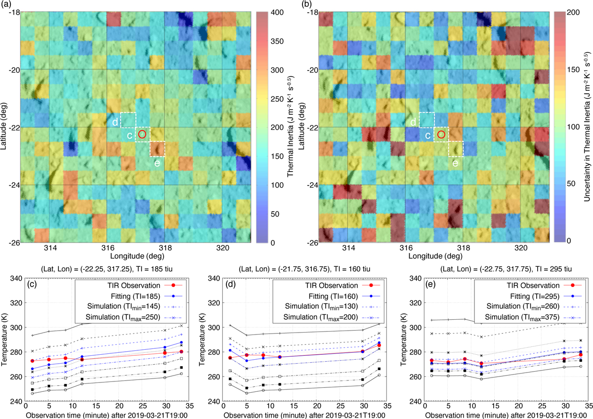
Thermal inertia of the MASCOT landing region, (a) Thermal inertia map. The background image is the same ONC-T image as in Fig. 7. The MASCOT landing site is indicated by a red circle, (b) Map of the thermal inertia uncertainty, defined as the difference between the maximum and minimum possible thermal inertia values, (c–e) Temperature history of the three grid cells highlighted with a dashed line in panels a and b. The red curves are the observations, and others are simulations. In each plot, the black curves represent the simulated temperature with thermal inertia values of 50, 100, 200, 300, 400, 500, and 750 J m2 K−1 s−0.5. The solid blue curve represents the (interpolated) simulated temperature profile with the best-guess thermal inertia, for which the RMS in Eq. (5) is minimum, whereas the two dashed blue curves are the profiles with the minimum and maximum possible thermal inertia.
Current usage metrics show cumulative count of Article Views (full-text article views including HTML views, PDF and ePub downloads, according to the available data) and Abstracts Views on Vision4Press platform.
Data correspond to usage on the plateform after 2015. The current usage metrics is available 48-96 hours after online publication and is updated daily on week days.
Initial download of the metrics may take a while.