Fig. 6
Download original image
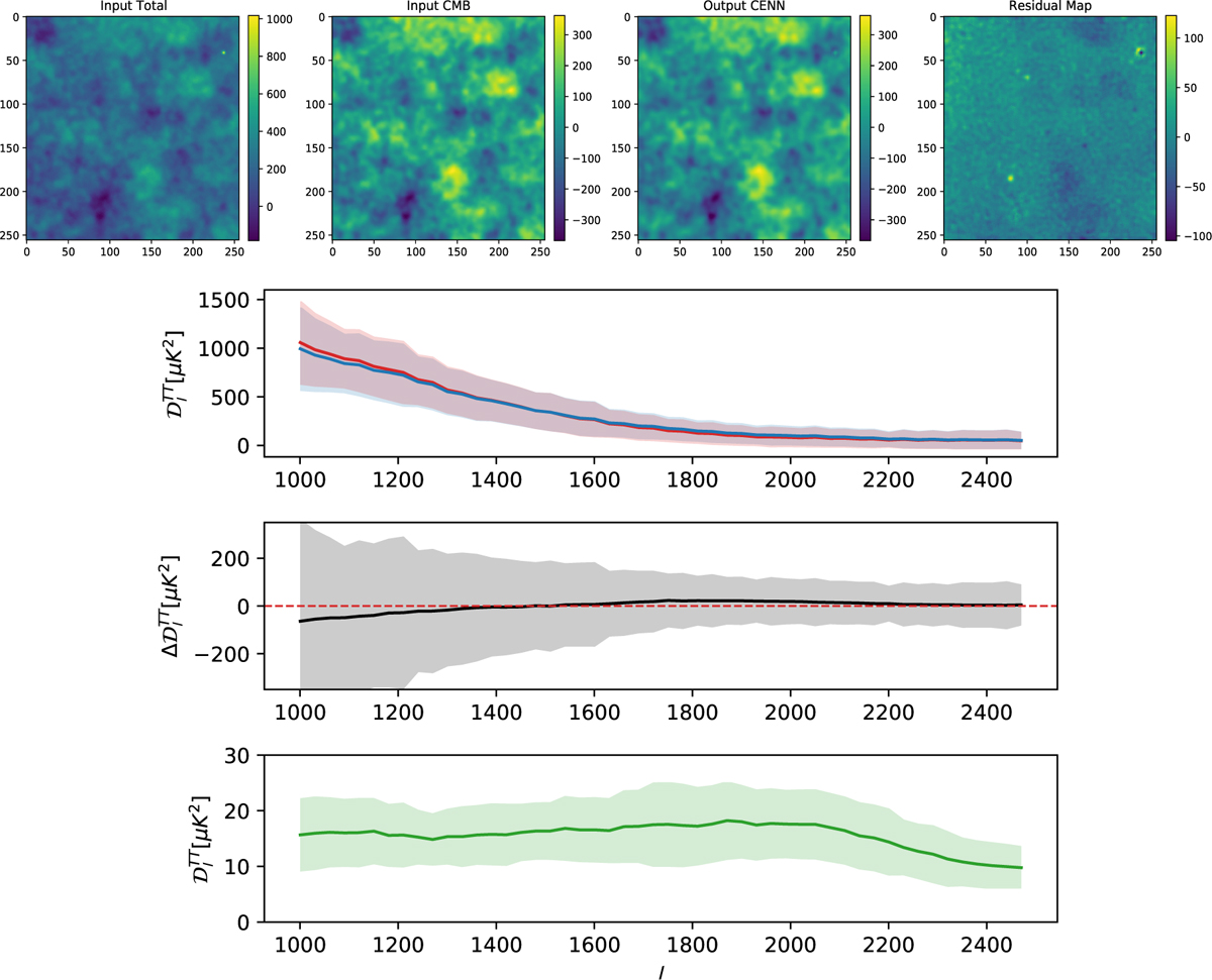
Analysis of a patch highly contaminated at small scales. Top panel: sky patch selected with high contamination at small scales. The patches represent from left to right all the emission, the CMB label, the neural network output, and the residual map computed as the difference between the second and third columns. The frequency for all patches is 217 GHz, and their temperature (in µKCMB) is shown in the right vertical bars. Bottom panel: CMB power spectrum comparison computed over the patch shown in the top panel. The true CMB is represented in the top panel as a blue line, and the output from CENN is shown as a red line. The corresponding uncertainties (i.e. the standard deviation) are shown as blue and red areas, respectively. The difference ![]() between input and output is plotted in the middle panel as a black line, and its uncertainty is the grey area. The power spectrum of the residual map is represented as a green line in the bottom panel. The green area is its uncertainty (also the standard deviation).
between input and output is plotted in the middle panel as a black line, and its uncertainty is the grey area. The power spectrum of the residual map is represented as a green line in the bottom panel. The green area is its uncertainty (also the standard deviation).
Current usage metrics show cumulative count of Article Views (full-text article views including HTML views, PDF and ePub downloads, according to the available data) and Abstracts Views on Vision4Press platform.
Data correspond to usage on the plateform after 2015. The current usage metrics is available 48-96 hours after online publication and is updated daily on week days.
Initial download of the metrics may take a while.