Fig. 5.
Download original image
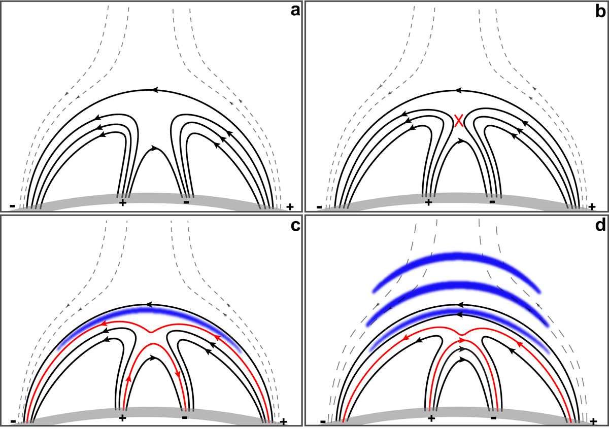
Cartoon model demonstrating the failed eruption of the magnetic breakout system and the generation of the QFP wave train. In this figure, only a selection of representative field lines are plotted, and the dashed lines represent the background coronal field. The arrow marked on each line indicates the direction of the magnetic field, the gray thick curve indicates the solar surface, and minus and plus symbols indicate the negative and positive polarities, respectively. Panel a shows the initial magnetic configuration. The red cross in panel b indicates the reconnection site, while the red curves in panels c and d represent the newly formed reconnected field lines. The blue thick curves in panels c and d show the wavefronts generated by the stretching and expansion of the high-lying reconnected coronal loops.
Current usage metrics show cumulative count of Article Views (full-text article views including HTML views, PDF and ePub downloads, according to the available data) and Abstracts Views on Vision4Press platform.
Data correspond to usage on the plateform after 2015. The current usage metrics is available 48-96 hours after online publication and is updated daily on week days.
Initial download of the metrics may take a while.