Fig. 6.
Download original image
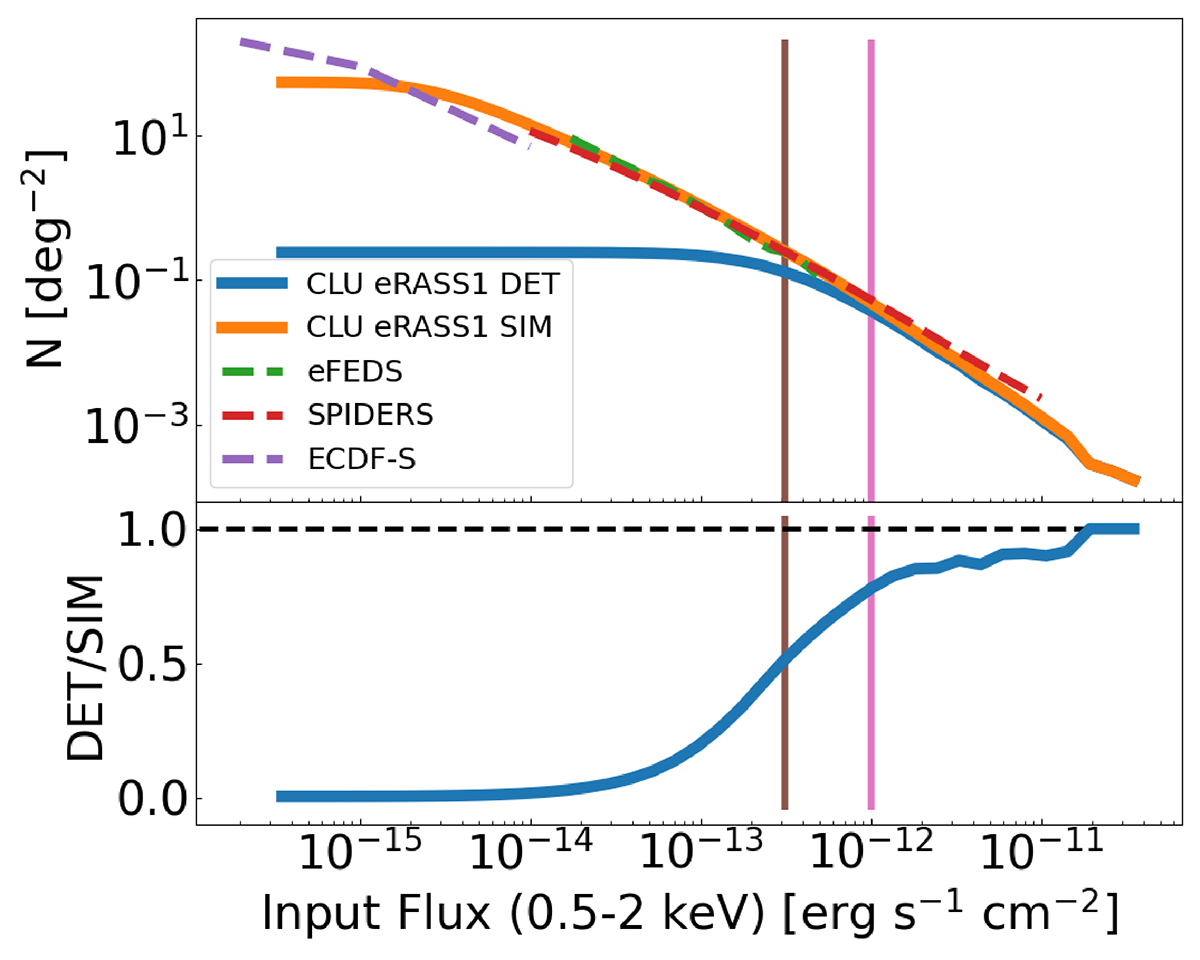
Cumulative number of clusters per square degree as a function of flux. Top panel: solid blue (orange) line shows the logN–logS built with the sample of detected (simulated) clusters. The green dashed line shows the distributions of the eFEDS sample (Liu et al. 2022a), the red one denotes the SPIDERS sample (Finoguenov et al. 2020), and the pink one the ECDF-S (Finoguenov et al. 2015). The brown and pink vertical lines locate the eROSITA flux value where the ratio between the detected and simulated populations is equal to 0.5 and 0.8, respectively. Bottom panel: ratio between the logN–logS of detected and simulated clusters. A black dashed line denotes a ratio equal to 1.0.
Current usage metrics show cumulative count of Article Views (full-text article views including HTML views, PDF and ePub downloads, according to the available data) and Abstracts Views on Vision4Press platform.
Data correspond to usage on the plateform after 2015. The current usage metrics is available 48-96 hours after online publication and is updated daily on week days.
Initial download of the metrics may take a while.