Fig. B.1.
Download original image
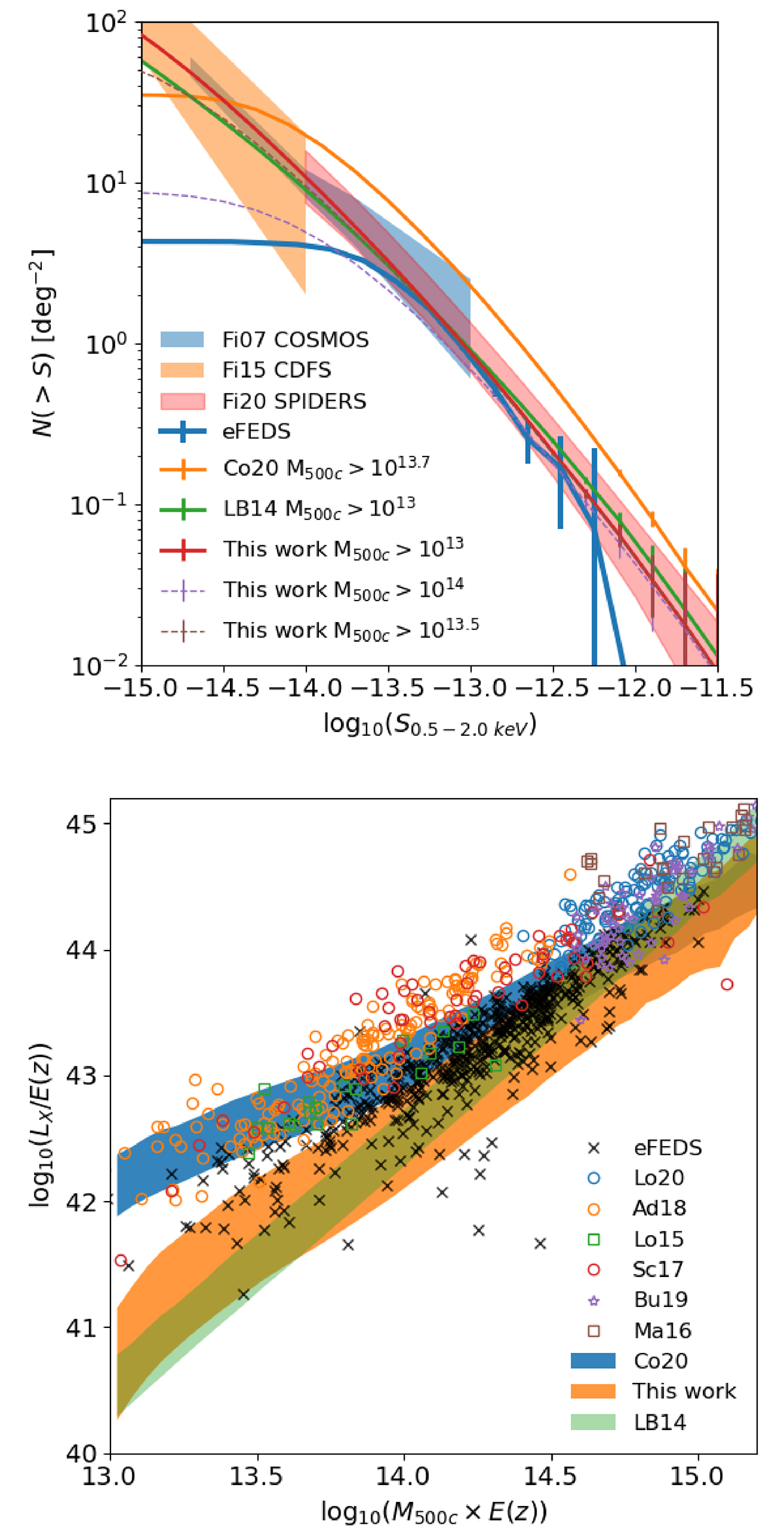
Improved cluster model. Top panel: number density of sources as function of flux. The solid orange (red) line shows the prediction of the model before (after) applying the correction. The shaded areas in blue, orange, and red denote the logN–logS from Finoguenov et al. (2007, 2015, 2020). The green and blue lines show a comparison to Le Brun et al. (2014) and Liu et al. (2022a). The dashed pink and brown lines denote the model corrected for higher mass thresholds. Bottom panel: relation between X-ray luminosity and mass. The blue (orange) shaded area shows the prediction of the model before (after) applying the correction. The green shaded area denotes the relation from Le Brun et al. (2014). Additional samples are shown by blue circles (Lovisari et al. 2020), orange circles (Adami et al. 2018), green squares (Lovisari et al. 2015), red circles (Schellenberger & Reiprich 2017a), pink stars (Bulbul et al. 2019), and brown squares (Mantz et al. 2016).
Current usage metrics show cumulative count of Article Views (full-text article views including HTML views, PDF and ePub downloads, according to the available data) and Abstracts Views on Vision4Press platform.
Data correspond to usage on the plateform after 2015. The current usage metrics is available 48-96 hours after online publication and is updated daily on week days.
Initial download of the metrics may take a while.