Fig. 17.
Download original image
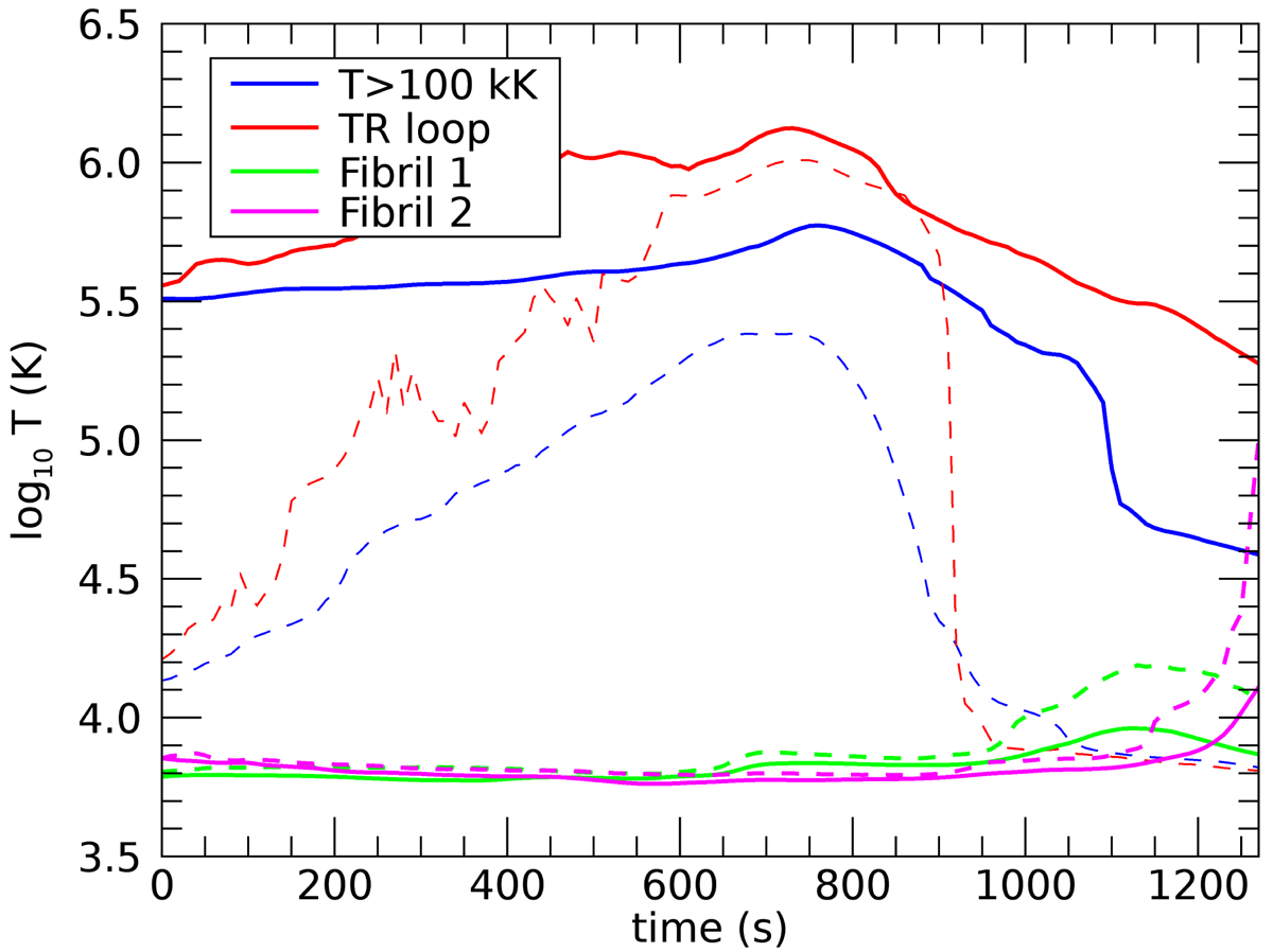
Mean temperature of sets of corks as functions of time. The blue line shows results for a random sample of 100 000 corks at similar heights as the corks in fibrils 1 and 2 and which had a temperature above 100 K at the seed time. The red line shows the results for corks near an individual field line with similar height of the apex to fibrils 1 and 2 but in a low-density region. The associated dashed lines show the 10th percentiles, to illustrate cooling due to draining of material towards the chromosphere. Values for the means of the corks in the fibrils are also shown, and their dashed lines indicate the 90th percentile to illustrate heating to transition region temperatures.
Current usage metrics show cumulative count of Article Views (full-text article views including HTML views, PDF and ePub downloads, according to the available data) and Abstracts Views on Vision4Press platform.
Data correspond to usage on the plateform after 2015. The current usage metrics is available 48-96 hours after online publication and is updated daily on week days.
Initial download of the metrics may take a while.