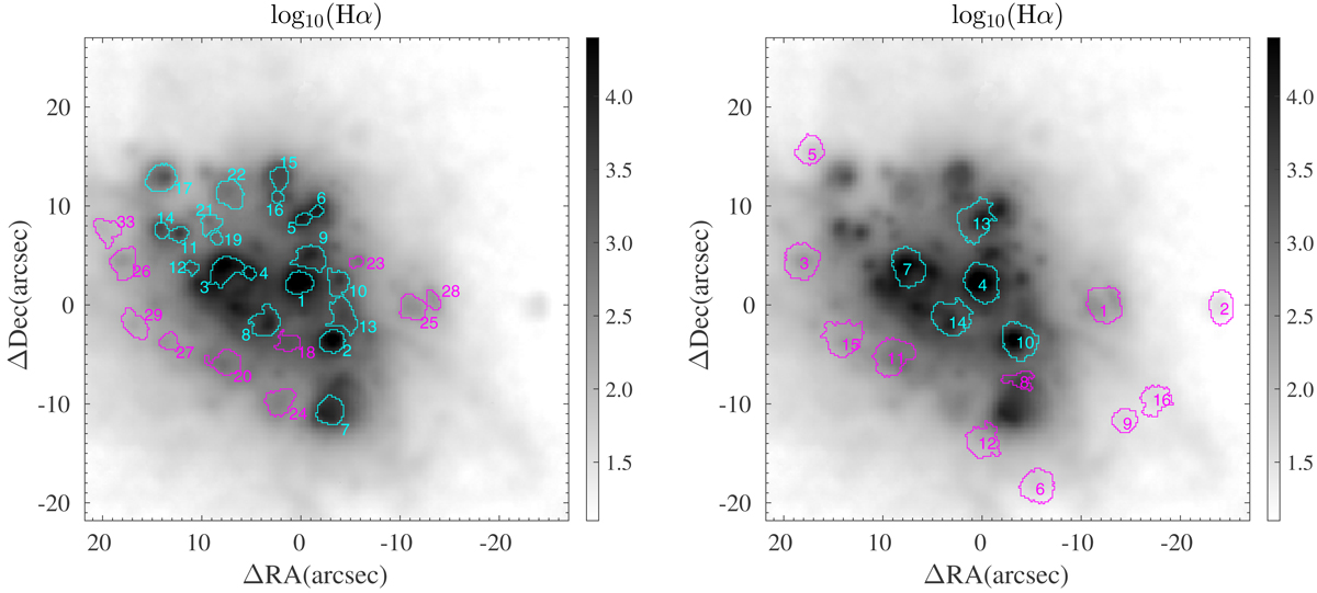
Fig. 9.
Download original image
Individual regions of Haro 14 for which an integrated spectrum has been generated, which is overplotted on a Hα flux map. The color of the knots indicates their position in the [O III]/Hβ versus [O I]/Hα diagnostic diagram: knots below the maximum starburst line are shown in blue, and knots above and to the right of the line are shown in magenta (see also Fig. 12). Left panel: emission sources identified in the Hα flux map. Labels correspond to their number (L1, L2, ..., L33) in the catalog of Tables 3, A.1, and A.2. Right panel: regions of high excitation identified in the galaxy. Labels correspond to their number (Ex1, Ex2, ..., Ex16) in the catalog of Tables 4 and 5.
Current usage metrics show cumulative count of Article Views (full-text article views including HTML views, PDF and ePub downloads, according to the available data) and Abstracts Views on Vision4Press platform.
Data correspond to usage on the plateform after 2015. The current usage metrics is available 48-96 hours after online publication and is updated daily on week days.
Initial download of the metrics may take a while.