Fig. 3
Download original image
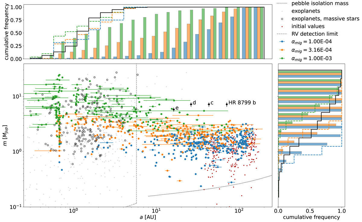
Mass-distance plot comparing all simulated planets to the known exoplanet population. Small red dots indicate the initial values of the simulations. The pebble isolation mass is shown with a dotted line for α = 10−3. Blue, orange and green dots denote the planets from simulations with α viscosity parameters 10−4, 3.16 × 10⁻⁴, and 10−3, respectively. The x-bars extend from the perihelion to the aphelion distances for a given planet. Gray dots denote the exoplanet population detected via radial velocity and black circles mark those around massive stars with luminosities exceeding 5 L⊙. For reference, the planets of HR 8799 are shown as black dots (Wang et al. 2018). A dashed line divides the parameter space into a region observable by current radial velocity measurements with a sensitivity of 1 m s−1 and observation period of up to 10 yr and a currently not observable region. The histograms depict the normalized cumulative frequencies of the final masses (right) and semi-major axes (top). The color scheme is the same as for the main plot, where the bars show the distribution among all simulated planets and the dashed outlines represent the distribution among hypothetically observable planets. The cumulative frequencies among the exoplanets of massive stars with L > 5 L⊙ are plotted for comparison with a black solid outline.
Current usage metrics show cumulative count of Article Views (full-text article views including HTML views, PDF and ePub downloads, according to the available data) and Abstracts Views on Vision4Press platform.
Data correspond to usage on the plateform after 2015. The current usage metrics is available 48-96 hours after online publication and is updated daily on week days.
Initial download of the metrics may take a while.