Fig. 4.
Download original image
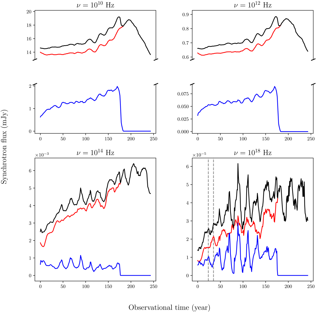
Light curves obtained by integrating the total synchrotron flux. The computation of the light curve is realized for four different frequencies (see the titles). The overall flux is shown in black (upper curve), with the component from the original moving shock marked in blue (lowest curve) and the remaining jet emission in red. The flux is integrated from the injection time of the ejecta (at t = 0 yr) until t ∼ 250 yr. The dashed vertical lines in the plot with the X-ray light curve indicate the position of the first main flare (blue curve) and the associated flare echo from the perturbed jet (red curve). The flux is evaluated at the distance of the radio galaxy 3C 111.
Current usage metrics show cumulative count of Article Views (full-text article views including HTML views, PDF and ePub downloads, according to the available data) and Abstracts Views on Vision4Press platform.
Data correspond to usage on the plateform after 2015. The current usage metrics is available 48-96 hours after online publication and is updated daily on week days.
Initial download of the metrics may take a while.