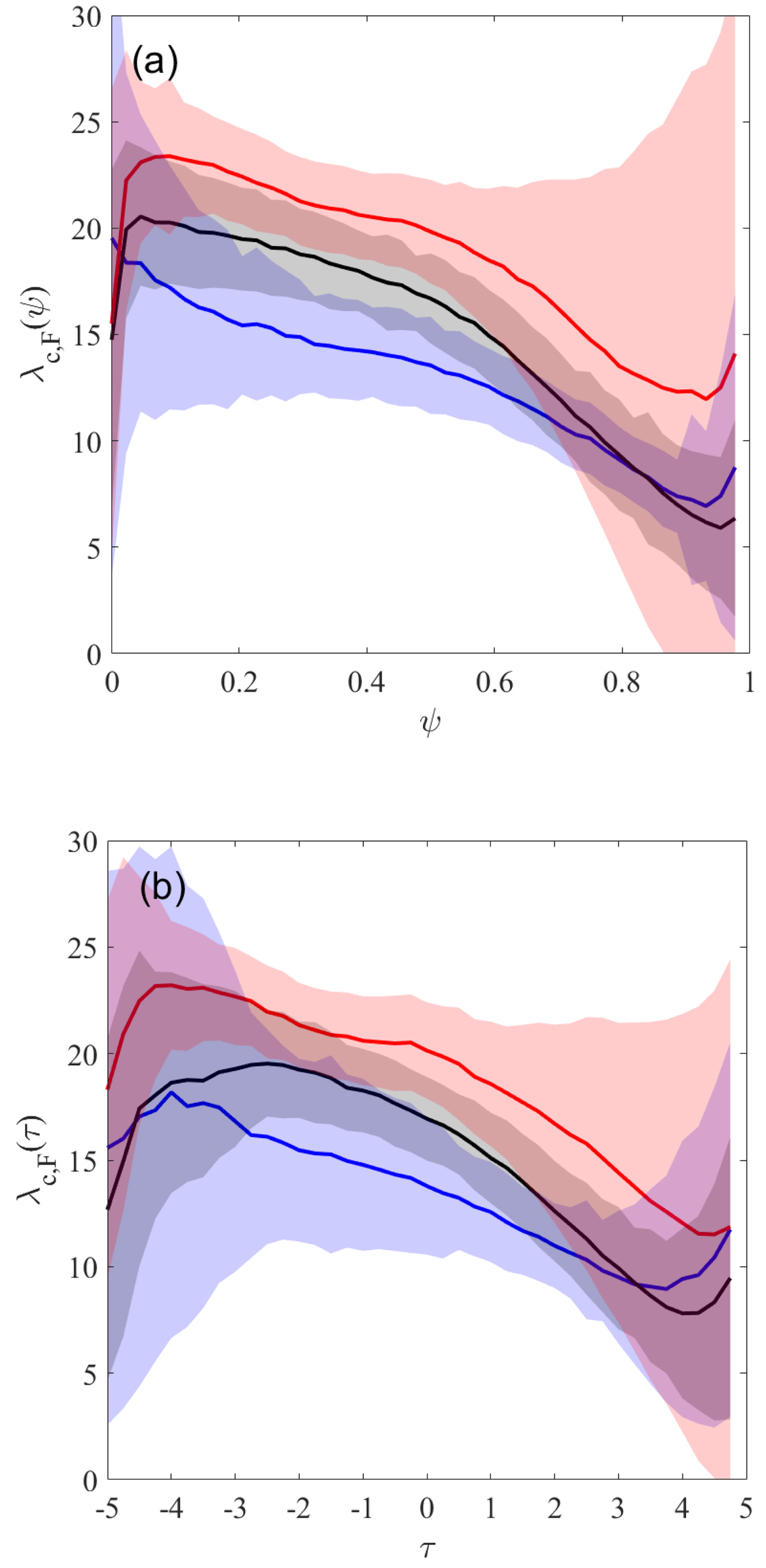
Fig. 9.
Download original image
Butterfly tracks in the 2×2D dynamo model sorted by cycle amplitude: (a) tracks of the active latitude vs. cycle phase; (b) tracks of the active latitude vs. time; Red, black, and blue curves represent flux-weighted mean latitudes for subsamples of strong, average, weak cycles, respectively, as described in the text. Shaded areas mark the standard deviations of the actual data around the mean curves.
Current usage metrics show cumulative count of Article Views (full-text article views including HTML views, PDF and ePub downloads, according to the available data) and Abstracts Views on Vision4Press platform.
Data correspond to usage on the plateform after 2015. The current usage metrics is available 48-96 hours after online publication and is updated daily on week days.
Initial download of the metrics may take a while.