Fig. 8.
Download original image
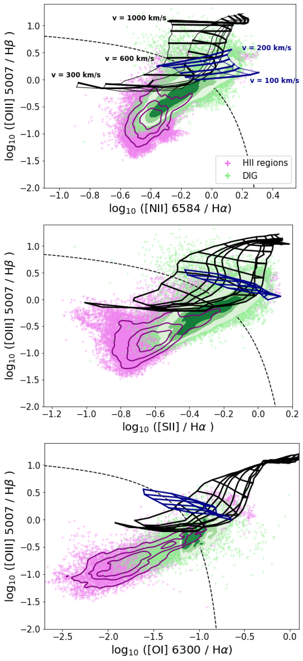
BPT emission line diagrams. Each point corresponds to a Voronoi bin, and is colour-coded as located in an H II region (pink) or in the DIG (green). The contours overplotted on the data correspond to iso-proportions of the density, with a probability mass ≤0.25, 0.5, 0.75 and 1. The data are compared to the extreme starburst line from Kewley et al. (2001, black dashed line), the fast shock models from Allen et al. (2008, black grid), and slow shock models from Rich et al. (2011, blue grid).
Current usage metrics show cumulative count of Article Views (full-text article views including HTML views, PDF and ePub downloads, according to the available data) and Abstracts Views on Vision4Press platform.
Data correspond to usage on the plateform after 2015. The current usage metrics is available 48-96 hours after online publication and is updated daily on week days.
Initial download of the metrics may take a while.