Fig. 4.
Download original image
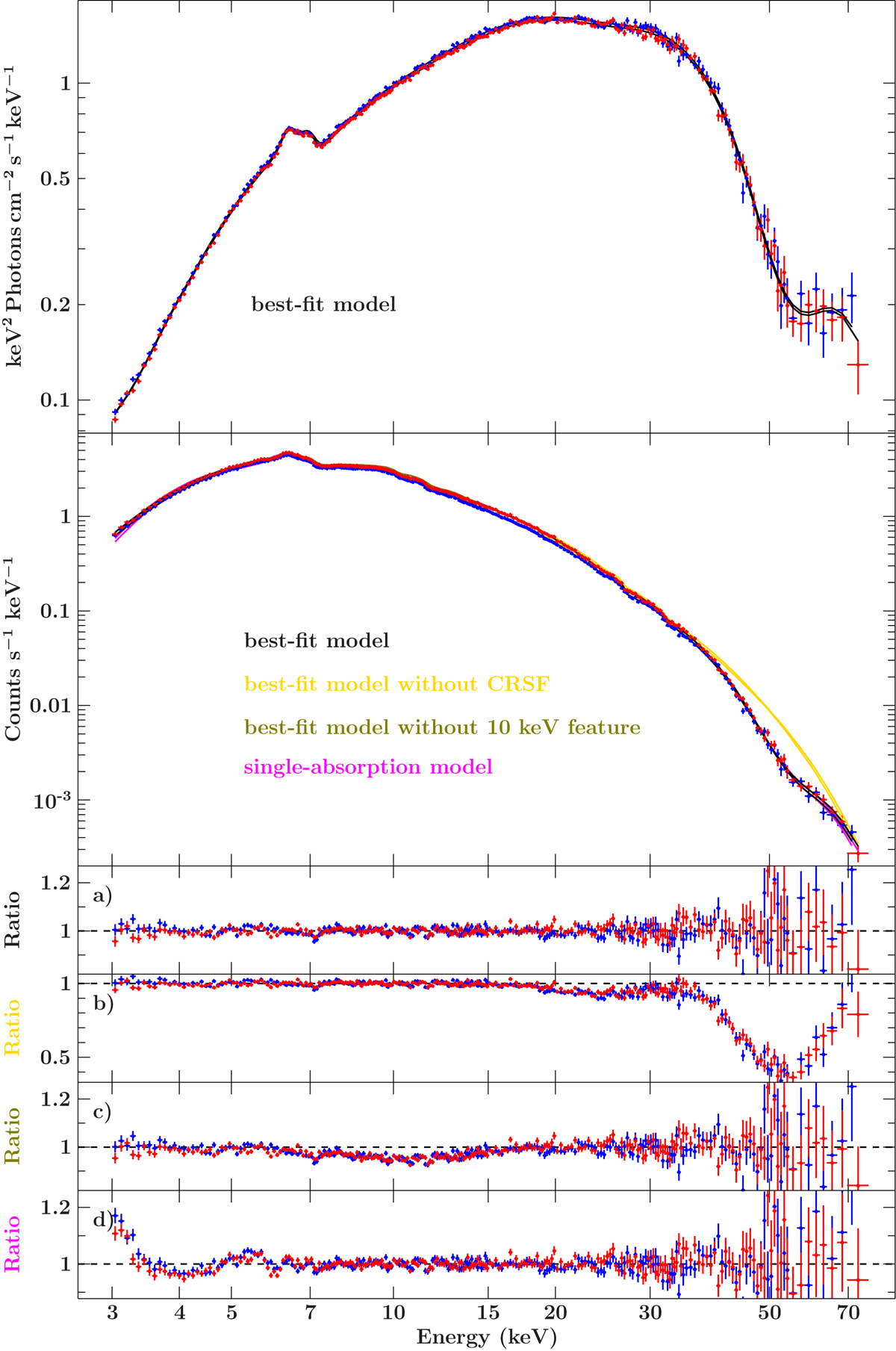
Time-averaged spectrum for observation I. The FPMA data are in red and FPMB data in blue, and models for both focal plane modules are shown in the same colour and are hardly distinguishable with the naked eye. The first two panels show, respectively, the unfolded spectrum and the count spectrum. The residual panels are (from top to bottom): (a) best-fit model (black), (b) best-fit model with CRSFs (yellow) turned off but not fitted again, (c) best-fit model with 10 keV feature (green) turned off but not fitted again, and (d) single-absorption model (magenta). Green and magenta lines are almost hidden by the data and the best-fit model in the data panel.
Current usage metrics show cumulative count of Article Views (full-text article views including HTML views, PDF and ePub downloads, according to the available data) and Abstracts Views on Vision4Press platform.
Data correspond to usage on the plateform after 2015. The current usage metrics is available 48-96 hours after online publication and is updated daily on week days.
Initial download of the metrics may take a while.