Fig. B.4
Download original image
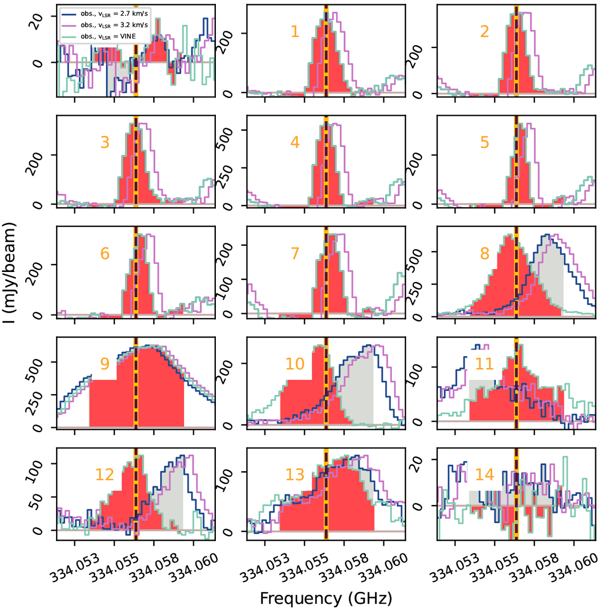
Spectra of the 334.056 GHz line at 15 different position that are numbered and displayed in Fig. B.3. The different colored curves correspond to different vLSR being applied. The different colored curves correspond to different vLSR being applied. Blue corresponds to vLSR = 2.7 km s−1 that is most appropriate for source B, purple corresponds to vLSR = 3.2 km s−1 that is most appropriate for source A, and turquoise corresponds to the position-dependent vLSR of the VINE method. The red region shows the region being integrated for the VINE map in Fig. 2b. The gray region shows the region being integrated during the classical (non-VINE) method in Fig. B.3 (near sourceB it is fully overlapping with the red region).
Current usage metrics show cumulative count of Article Views (full-text article views including HTML views, PDF and ePub downloads, according to the available data) and Abstracts Views on Vision4Press platform.
Data correspond to usage on the plateform after 2015. The current usage metrics is available 48-96 hours after online publication and is updated daily on week days.
Initial download of the metrics may take a while.