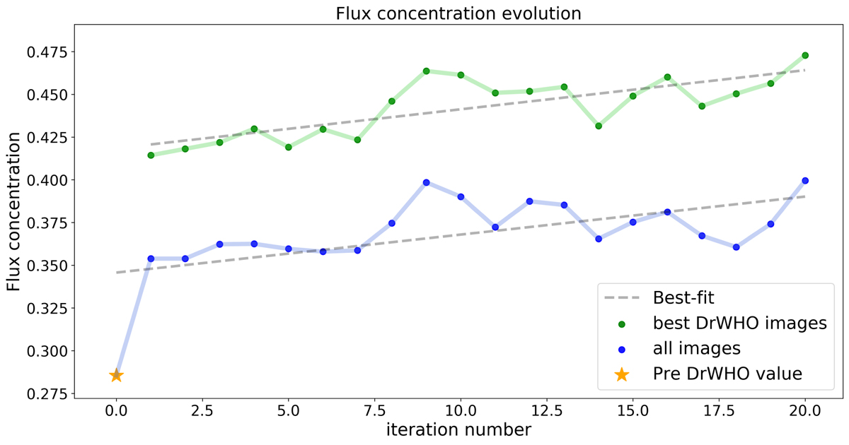
Fig. 7.
Download original image
Evolution of the FC over 20 iterations of DrWHO, corresponding to a period of 10 min, including the nFC of the PSF preceding the run. The blue curve corresponds to the evolution of the nFC of all the PSF averaged over the DrWHO iteration, while the green one corresponds to the evolution of the nFC of the 10% PSF chosen by DrWHO. The best linear fit is presented.
Current usage metrics show cumulative count of Article Views (full-text article views including HTML views, PDF and ePub downloads, according to the available data) and Abstracts Views on Vision4Press platform.
Data correspond to usage on the plateform after 2015. The current usage metrics is available 48-96 hours after online publication and is updated daily on week days.
Initial download of the metrics may take a while.