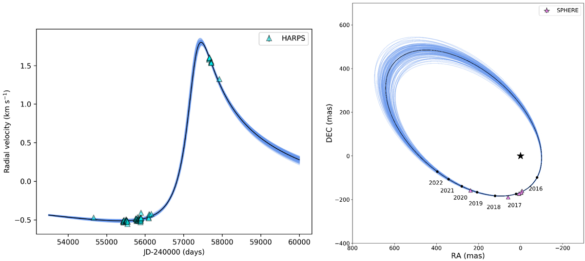
Fig. C.2

Download original image
Comparison of data to model orbits from the PT-MCMC posterior pdf. Left: RV data versus model comparison for HIP 113201AB. HARPS data points are plotted as cyan triangles. The best fit orbit to the direct imaging data, RV data, and both Hipparcos and Gaia proper motion anomalies is plotted as a solid black line; blue lines depict 100 random orbits taken from the final converged PT-MCMC posterior pdf. Right: Direct imaging data versus model comparison for HIP 113201AB. SPHERE data points are plotted as lavender triangles. The best fit orbit to the direct imaging data, RV data, and both Hipparcos and Gaia proper motion anomalies is plotted as a solid black line; blue lines depict 100 random orbits taken from the final converged PT-MCMC posterior pdf. The position of the primary is depicted with a black star symbol.
Current usage metrics show cumulative count of Article Views (full-text article views including HTML views, PDF and ePub downloads, according to the available data) and Abstracts Views on Vision4Press platform.
Data correspond to usage on the plateform after 2015. The current usage metrics is available 48-96 hours after online publication and is updated daily on week days.
Initial download of the metrics may take a while.


