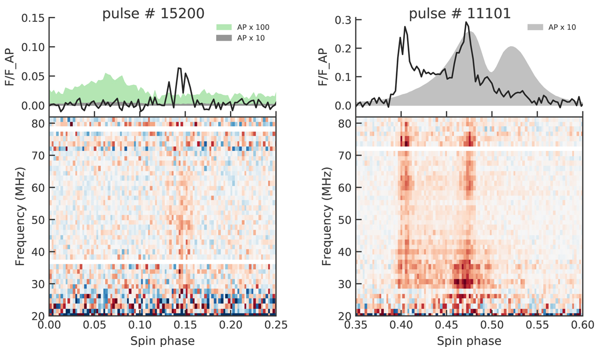
Fig. 5.
Download original image
Strongest pulse from the bridge phase region (left) and an example of a strong pulse with components in both the precursor and MP phase regions (right). Upper plot: band-integrated signal, with shaded regions marking 10× and (left only) 100× the average pulse strength. Lower plot: pulse spectrum with each frequency subband normalized by the period-integrated fluence of the average pulse in the same subband. The colorbar span is set by the maximum value on the spectrum of this particular pulse. Here and for the other VHF pulses the maximum value is calculated for frequencies above 30 MHz.
Current usage metrics show cumulative count of Article Views (full-text article views including HTML views, PDF and ePub downloads, according to the available data) and Abstracts Views on Vision4Press platform.
Data correspond to usage on the plateform after 2015. The current usage metrics is available 48-96 hours after online publication and is updated daily on week days.
Initial download of the metrics may take a while.