Fig. 6.
Download original image
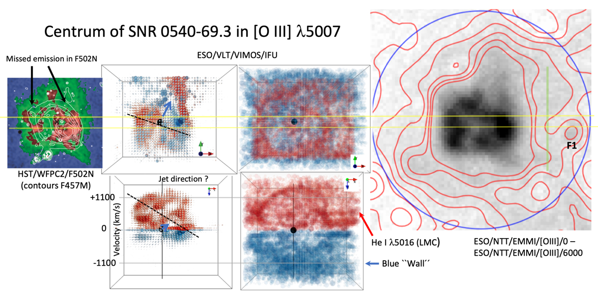
Right: 20″ × 20″ difference image between the NTT/EMMI/[O III]/0 and NTT/EMMI/[O III]/6000 images. The blue circle has the same meaning as in Fig. 5. The flux scaling is linear. To highlight the [O III] glow, red contours are inserted for intensities up to 23% of the peak surface intensity of the PWN. Filament F1 has been marked. North is up and east to the left. Middle two top panels: [O III] λ5007 as viewed by VIMOS/IFU Sandin et al. (2013). The left of the two middle panels shows the central part, where blue is for approaching ejecta, and red for receding. A possible jet axis is highlighted for the pulsar jet. The right of the two panels brings out fainter halo emission. Middle two bottom panels: same as the two top panels, but in velocity space. A symmetry axis (also shown in the top panel) is marked that goes through rings of [O III] emitting ejecta, and the possible jet axis is highlighted for the pulsar jet (guided by Fig. 4 of Sandin et al. 2013). For the lower right panel, likely contamination from LMC H II region He Iλ5016 is marked, as is also a region with emission on the approaching side (≤ − 750 km s−1) named the blue “Wall” (also seen for [O III] λ5007 in Fig. 10). Left: Wavelet filtered HST/WFPC2/F502N map and contours of a wavelet filtered HST/WFPC2/F457M map (Lundqvist et al. 2011). Areas where the F502N fails to detect [O III] emission are highlighted. To guide the eye, a 1″ slit with PA = 90° has been drawn across all top panels. A green line in the rightmost panel marks how far west the VIMOS field reaches. All images are to scale.
Current usage metrics show cumulative count of Article Views (full-text article views including HTML views, PDF and ePub downloads, according to the available data) and Abstracts Views on Vision4Press platform.
Data correspond to usage on the plateform after 2015. The current usage metrics is available 48-96 hours after online publication and is updated daily on week days.
Initial download of the metrics may take a while.