Fig. 1
Download original image
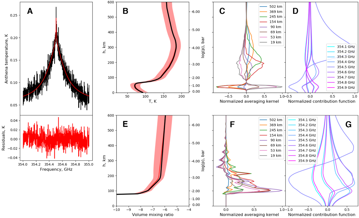
A: comparison between observed and best-fit simulated HCN (4-3) lines (black and red, respectively, upper panel), and the difference between the observed and fitted spectra (lower panel). B: retrieved temperature. C: corresponding averaging kernels. D: corresponding normalised contribution functions. E: HCN distribution derived from the spectrum. F: corresponding averaging kernels. G: corresponding normalised contribution functions. In (B) and (E), the black and red lines show the initial and retrieved profiles, respectively, and the pink shadow shows the error bars. AVKs and contributionfunctions are shown for selected altitudes and frequencies, respectively, for better representation (see plot legends).
Current usage metrics show cumulative count of Article Views (full-text article views including HTML views, PDF and ePub downloads, according to the available data) and Abstracts Views on Vision4Press platform.
Data correspond to usage on the plateform after 2015. The current usage metrics is available 48-96 hours after online publication and is updated daily on week days.
Initial download of the metrics may take a while.