Fig. 6.
Download original image
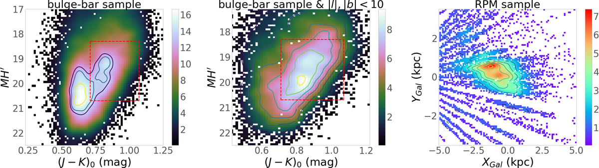
Illustration of our RPM selection. Left panel: RPM diagram. Contours show the most dense areas, highlighting two main density groups. Middle panel: same as left panel, but for the central region (|l|,|b|< 10 deg). In both panels, the red dashed box indicates the boundaries of our RPM selection. Right panel: Cartesian density map of stars satisfying the RPM cut.
Current usage metrics show cumulative count of Article Views (full-text article views including HTML views, PDF and ePub downloads, according to the available data) and Abstracts Views on Vision4Press platform.
Data correspond to usage on the plateform after 2015. The current usage metrics is available 48-96 hours after online publication and is updated daily on week days.
Initial download of the metrics may take a while.