Fig. 5.
Download original image
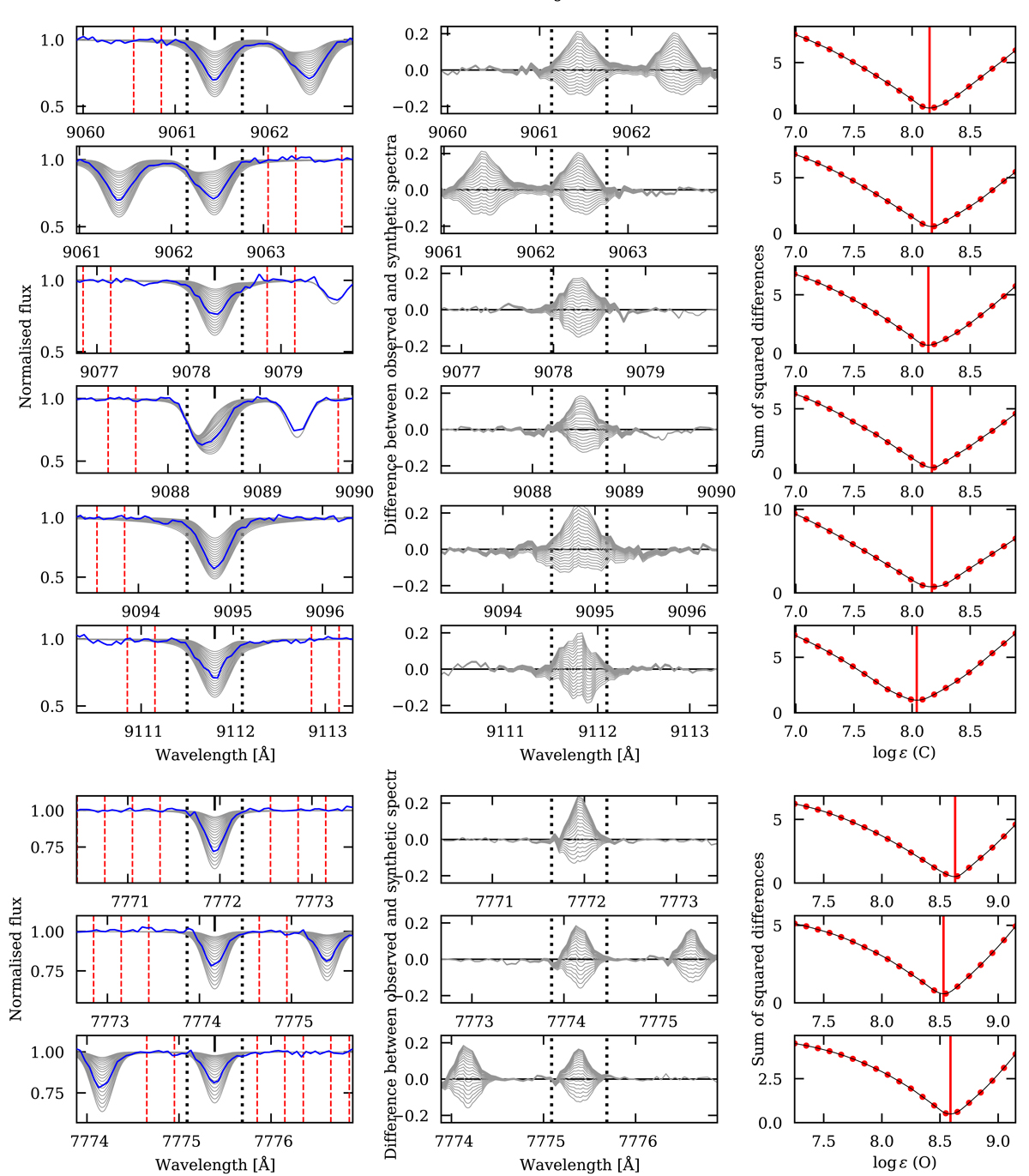
Example showing the determination of carbon abundances from the six different C I lines (plots in the top six rows) and the three O I lines (plots in the bottom three rows). The plots in the left column show the observed spectrum as red lines and 20 synthetic spectra with carbon abundances in steps of 0.1 dex as black lines. The plots in the middle column show the differences between the observed and synthetic spectra. The plots in the right column shows the sum of the squared differences between observed and synthetic spectra within ±0.3 of the central wavelengths of the C I and O I lines (marked by black vertical dotted lines in the plots in the left column). The vertical red solid line shows the minimum of the χ2-values for which the best fitting carbon and oxygen abundances are selected. For each line, we carried out a local normalisation of the observed spectrum, and the selected continuum regions are marked by dotted red vertical lines in the plots in the left column.
Current usage metrics show cumulative count of Article Views (full-text article views including HTML views, PDF and ePub downloads, according to the available data) and Abstracts Views on Vision4Press platform.
Data correspond to usage on the plateform after 2015. The current usage metrics is available 48-96 hours after online publication and is updated daily on week days.
Initial download of the metrics may take a while.