Fig. 12.
Download original image
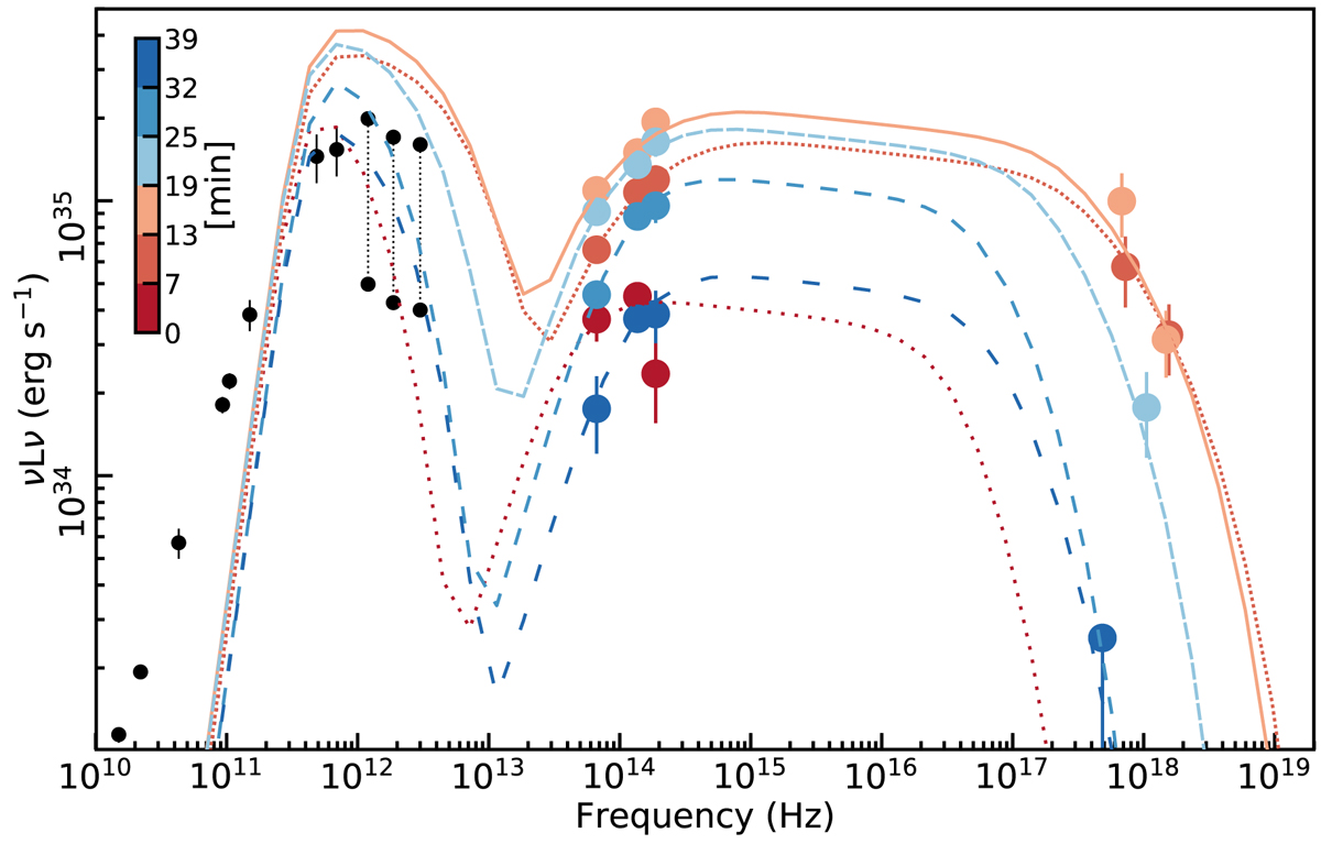
SEDs of the best-fit SSC models. The colors correspond to T1 to T6 as shown in the color bar. The colored point show the observed data for each time. The dark points show the submillimeter SED of Sgr A⋆ with the same data as in Fig. 4. As in the models involving only synchrotron emission, the flare evolution can largely be explained by progression of the electron density ne and high-energy cutoff γmax.
Current usage metrics show cumulative count of Article Views (full-text article views including HTML views, PDF and ePub downloads, according to the available data) and Abstracts Views on Vision4Press platform.
Data correspond to usage on the plateform after 2015. The current usage metrics is available 48-96 hours after online publication and is updated daily on week days.
Initial download of the metrics may take a while.