Fig. 11.
Download original image
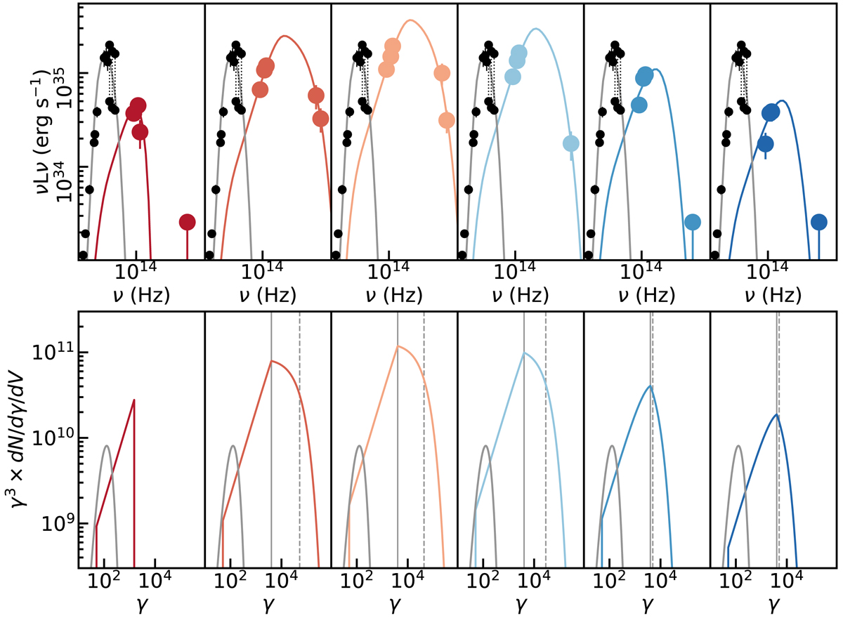
Temporal evolution of the flare SED and the temporal evolution of the electron energy distribution. Panels (left to right): temporal evolution from T1 to T6. Top row: observed SED of the flare (colored points) and the best-fit PLCoolγmax model (colored lines). The black points indicate the submillimeter SED of Sgr A⋆, with the same data as in Fig. 4. The thin gray line shows a thermal synchrotron spectrum matching the submillimeter data. Bottom row: electron energy distribution of the respective synchrotron spectra in the top row. Colored lines show the best-fit PLCoolγmax models; the thin gray line shows the electron energy distribution of the thermal spectrum. The positions of the cooling break and γmax are indicated with solid and dashed gray lines, respectively. To highlight the location of the breaks in the distributions, the cooling break, and the maximum acceleration the electron distribution is multiplied by a factor γ3.
Current usage metrics show cumulative count of Article Views (full-text article views including HTML views, PDF and ePub downloads, according to the available data) and Abstracts Views on Vision4Press platform.
Data correspond to usage on the plateform after 2015. The current usage metrics is available 48-96 hours after online publication and is updated daily on week days.
Initial download of the metrics may take a while.