Fig. G.1.
Download original image
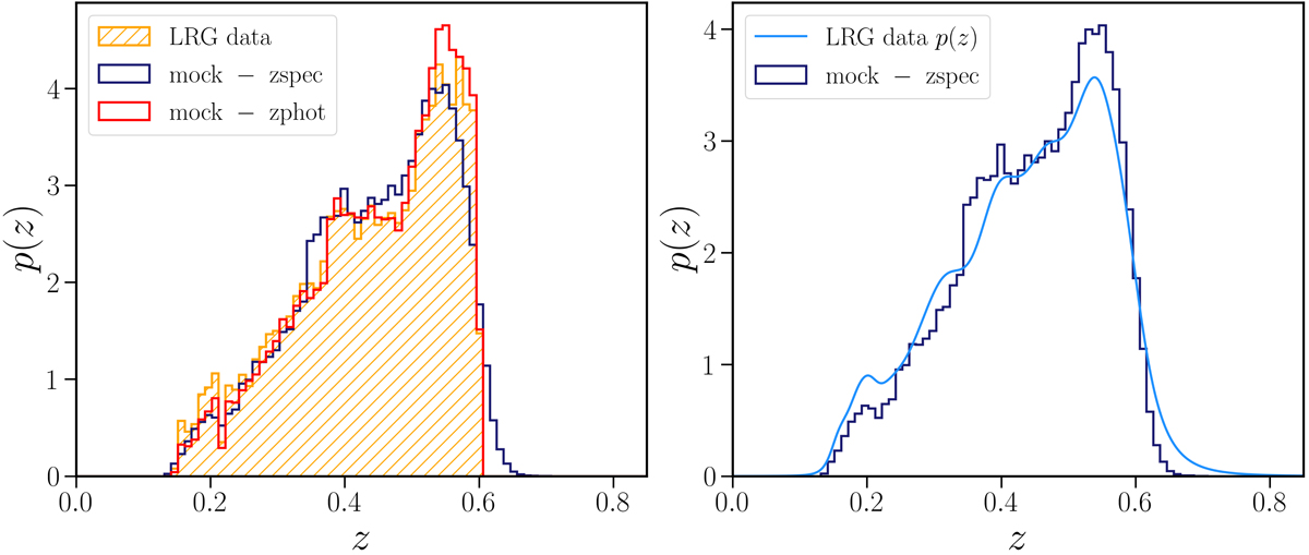
Comparison between the redshift distributions of the data and those reproduced by the mocks. Left: The photometric redshift distribution of our data is shown as an orange hatched histogram, while the solid red line shows the distribution of the photometric redshifts of the mock, obtained from the true (’spectroscopic’) redshifts (blue solid line) as detailed in the text. Right: Comparison of the mock spectroscopic redshift distribution (solid blue line) and the estimated spectroscopic distribution of our data (light blue line).
Current usage metrics show cumulative count of Article Views (full-text article views including HTML views, PDF and ePub downloads, according to the available data) and Abstracts Views on Vision4Press platform.
Data correspond to usage on the plateform after 2015. The current usage metrics is available 48-96 hours after online publication and is updated daily on week days.
Initial download of the metrics may take a while.