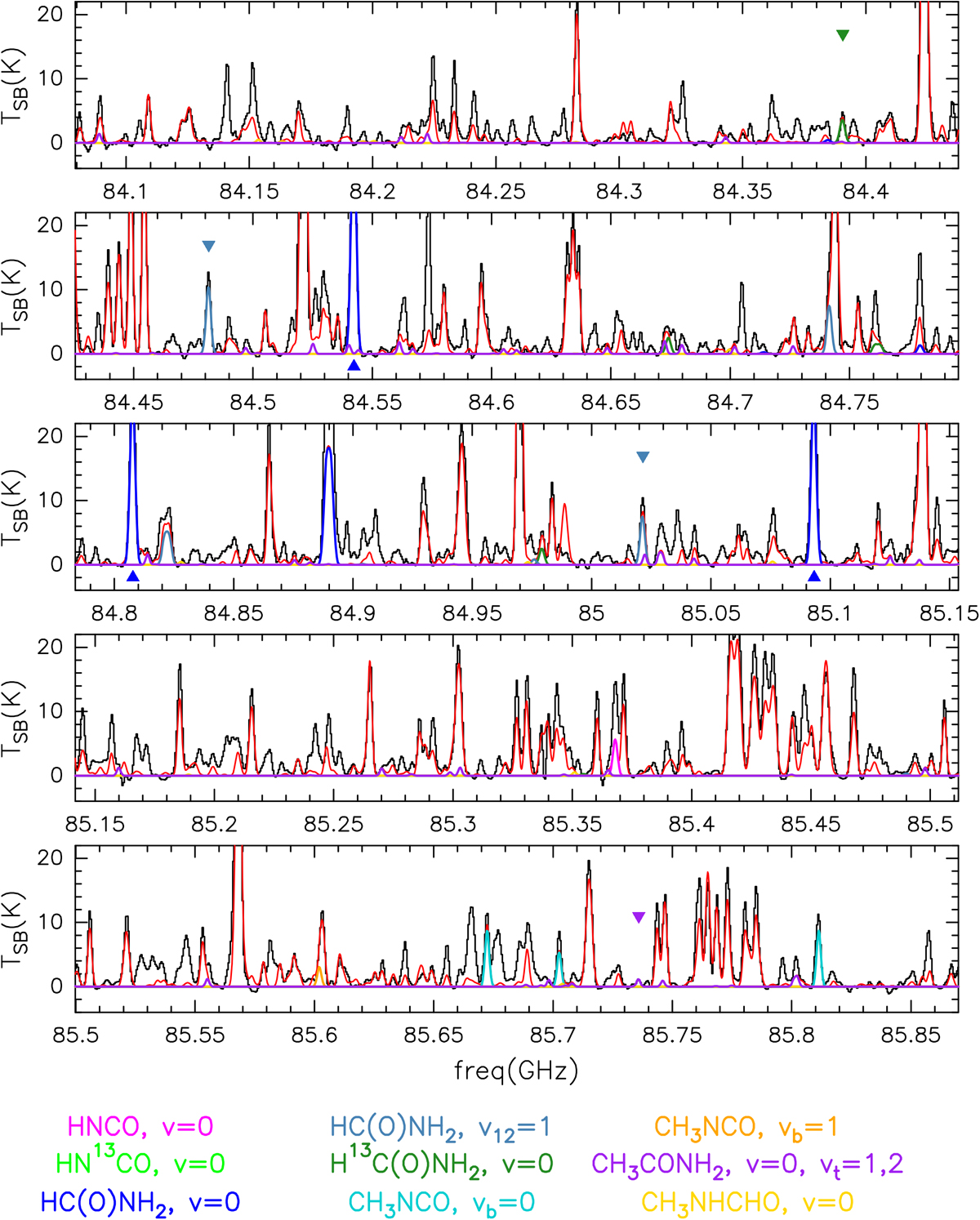
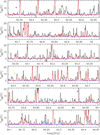
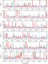
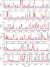
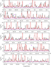
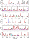
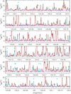
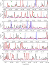
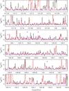
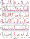
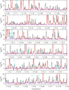
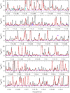
Fig. E.1
Download original image
Total spectrum of the GUAPOS project in black. The red curve shows the simulated spectrum taking into account all the species identified so far in the region. The best LTE fit of the molecules studied in this work is shown in different colours. The colour corresponding to each molecule is shown in the bottom panel. The coloured triangles indicate the transitions used to constrain the fitting procedure. Closer views of those transitions are given in Figs. 2–9.
Current usage metrics show cumulative count of Article Views (full-text article views including HTML views, PDF and ePub downloads, according to the available data) and Abstracts Views on Vision4Press platform.
Data correspond to usage on the plateform after 2015. The current usage metrics is available 48-96 hours after online publication and is updated daily on week days.
Initial download of the metrics may take a while.