Free Access
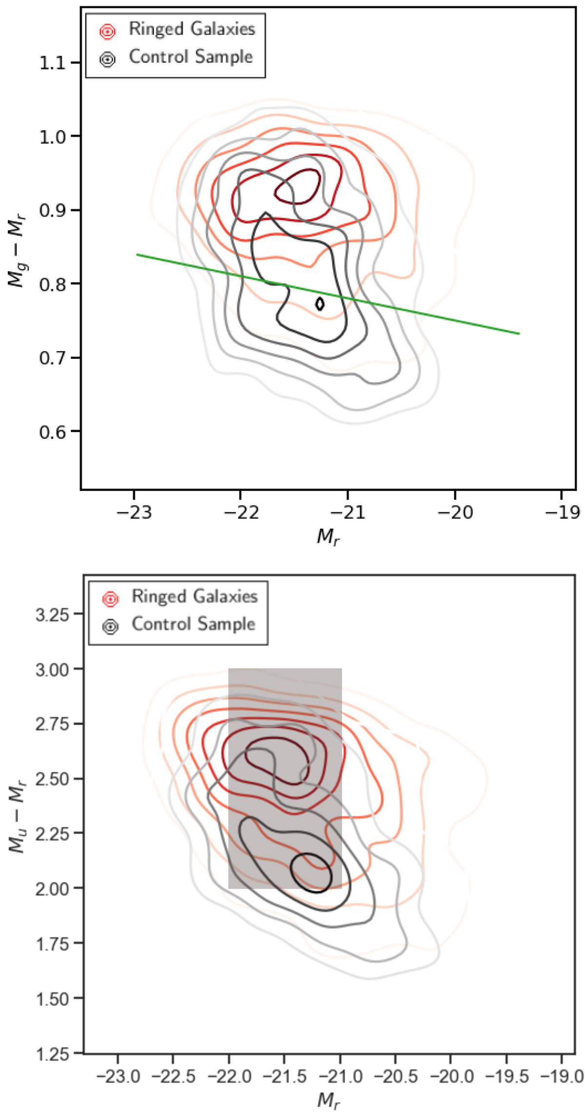
Fig. 12.
Download original image
Color–magnitude diagrams for ringed galaxies (red outlines) and for galaxies in the control sample (black outlines). The solid green line in the upper panel represents the fit proposed by Sridhar (2012). The gray area in the bottom panel represents the zone with the greatest agglomeration of galaxies.
Current usage metrics show cumulative count of Article Views (full-text article views including HTML views, PDF and ePub downloads, according to the available data) and Abstracts Views on Vision4Press platform.
Data correspond to usage on the plateform after 2015. The current usage metrics is available 48-96 hours after online publication and is updated daily on week days.
Initial download of the metrics may take a while.