Fig. 2.
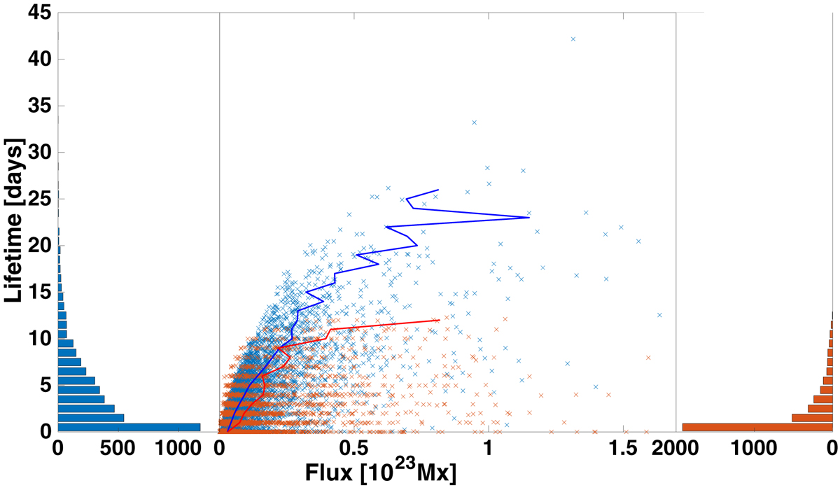
Relationship between active region lifetime and total magnetic flux. Middle panel: simulated and observed lifetimes of active regions as functions of their total unsigned flux. Blue markers are simulated lifetimes obtained from SFT simulations using NSO/SOLIS and HMI synoptic maps. Red markers are observed lifetimes obtained from SOLIS full-disk magnetograms. The solid blue and red curves show the median flux in lifetime bins with a width of one day for simulated and observed lifetimes, respectively. The blue and red bars on the left and right show the number of active regions in each bin.
Current usage metrics show cumulative count of Article Views (full-text article views including HTML views, PDF and ePub downloads, according to the available data) and Abstracts Views on Vision4Press platform.
Data correspond to usage on the plateform after 2015. The current usage metrics is available 48-96 hours after online publication and is updated daily on week days.
Initial download of the metrics may take a while.