Fig. 11
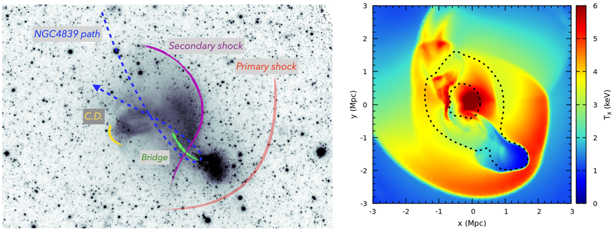
Comparison of the most salient features in the X-ray images and in simulations. Left: flattened image of the Coma cluster field with labels schematically marking some of the features associated with the merger with the NGC4839 group. The blue dashed line is the suggested trajectory of the group (Lyskova et al. 2019; Sheardown et al. 2019; Zhang et al. 2019), which enters the Coma cluster from NE, and is currently close to the apocenter. The presumed position of the primary shock is shown with the red curve so that it goes through the radio relic SW from the NGC4839 group. The purple curve marks the secondary shock caused by settling the displaced ICM back to the hydrostatic equilibrium. This is the most salient feature directly seen in the image as the surface brightness edge. The green line shows the fain X-ray “bridge” connecting NGC4839 and the main cluster, which is a possible trace of the group through the Coma cluster. Right: projected temperature map from simulations (Zhang et al. 2021, see their Fig. 8 for the original version of the figure). Thesimulations qualitatively reproduce the morphology of the cold gas and the positions of the primary and secondary shocks. In the simulations, the inner region is a complex mixture of shocks and contact discontinuities. It is, therefore, not surprising that real observations have both types of structures.
Current usage metrics show cumulative count of Article Views (full-text article views including HTML views, PDF and ePub downloads, according to the available data) and Abstracts Views on Vision4Press platform.
Data correspond to usage on the plateform after 2015. The current usage metrics is available 48-96 hours after online publication and is updated daily on week days.
Initial download of the metrics may take a while.