Fig. 4.
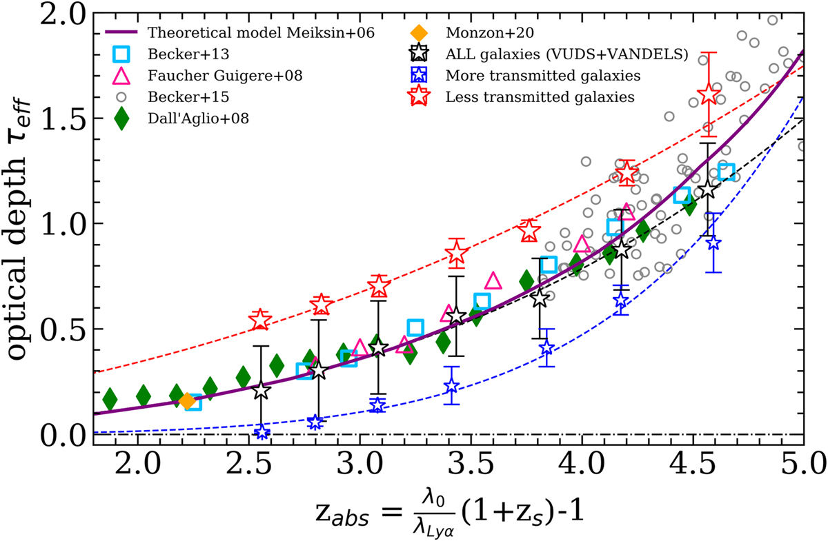
Evolution of the optical depth for each sample of our galaxies and comparison with QSO data. More IGM transmitted galaxies are shown by the blue stars, less transmitted galaxies are shown as red stars, and black star represent the full sample of our galaxies. Dashed lines represent the fit to each sample and are plotted in the same colors. We also show data from the literature with measurements from Dall’Aglio et al. (2008) as green diamonds, from Faucher-Giguère et al. (2008) as pink triangles, from Becker et al. (2013) as light blue squares, and from Becker et al. (2015) as empty gray circles. The orange point is based on galaxy data from Monzon et al. (2020). The solide purple line is the theoretical model from Meiksin (2006).
Current usage metrics show cumulative count of Article Views (full-text article views including HTML views, PDF and ePub downloads, according to the available data) and Abstracts Views on Vision4Press platform.
Data correspond to usage on the plateform after 2015. The current usage metrics is available 48-96 hours after online publication and is updated daily on week days.
Initial download of the metrics may take a while.