Fig. 3.
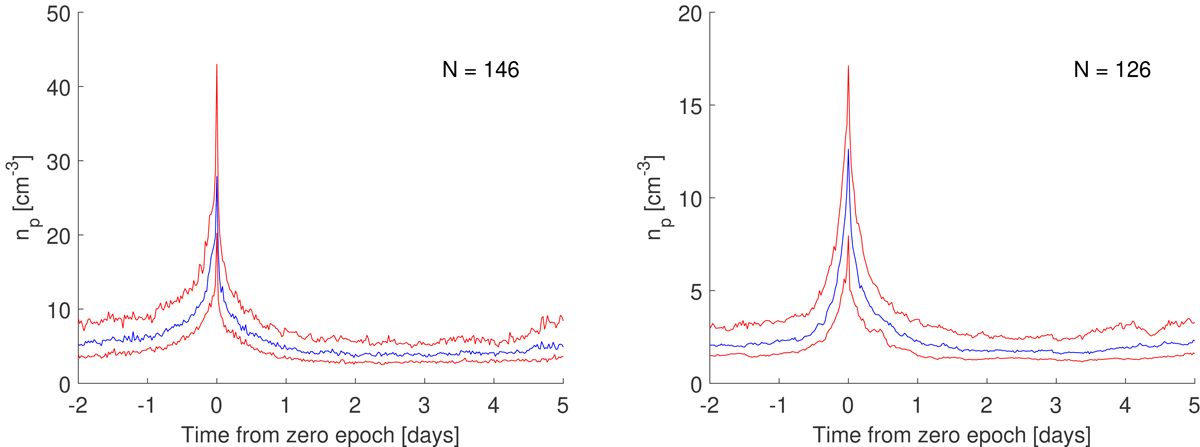
Superposed epoch analysis for solar wind density at Earth (left panel) and Mars (right panel). The maximum density of every event is shifted to 0 on the x-axis. The blue curve represents the median, the upper and lower red curves represent the upper and lower quartile, respectively. The y-axes of the two plots have different scales.
Current usage metrics show cumulative count of Article Views (full-text article views including HTML views, PDF and ePub downloads, according to the available data) and Abstracts Views on Vision4Press platform.
Data correspond to usage on the plateform after 2015. The current usage metrics is available 48-96 hours after online publication and is updated daily on week days.
Initial download of the metrics may take a while.