Fig. 4.
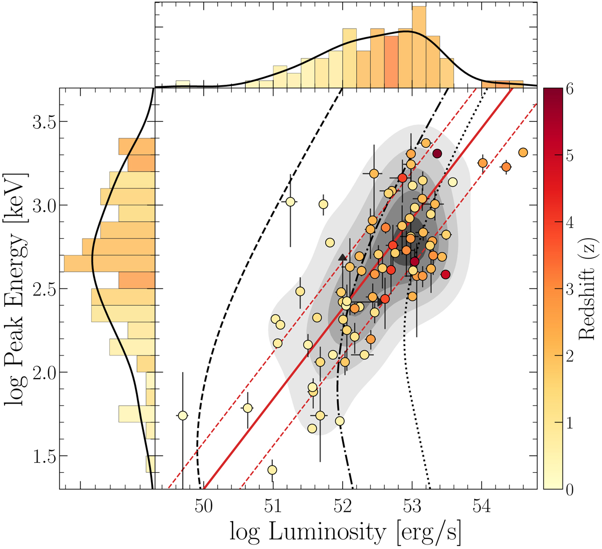
Ep − L plane for the Swift/eBAT6 sample. The individual data points are colour-coded by redshift; the filled red line represents the Ep − Liso relation found by Pescalli et al. (2016) for this sample and the dashed red lines represents the scatter. A 2D Gaussian kernel density estimation of the data is shown as grey shaded contours. The black dashed, dot-dashed, and dotted lines represent the detection threshold for ![]() and a fixed Band spectrum (α = 0.6, β = 2.5) at redshifts 0.3, 2, and 5, respectively. The side histograms represent the binned data and the colour of each bin represents the median redshift in that bin following the colour-code of the central panel; the black curve is the 1D Gaussian kernel density estimation.
and a fixed Band spectrum (α = 0.6, β = 2.5) at redshifts 0.3, 2, and 5, respectively. The side histograms represent the binned data and the colour of each bin represents the median redshift in that bin following the colour-code of the central panel; the black curve is the 1D Gaussian kernel density estimation.
Current usage metrics show cumulative count of Article Views (full-text article views including HTML views, PDF and ePub downloads, according to the available data) and Abstracts Views on Vision4Press platform.
Data correspond to usage on the plateform after 2015. The current usage metrics is available 48-96 hours after online publication and is updated daily on week days.
Initial download of the metrics may take a while.