Fig. 12
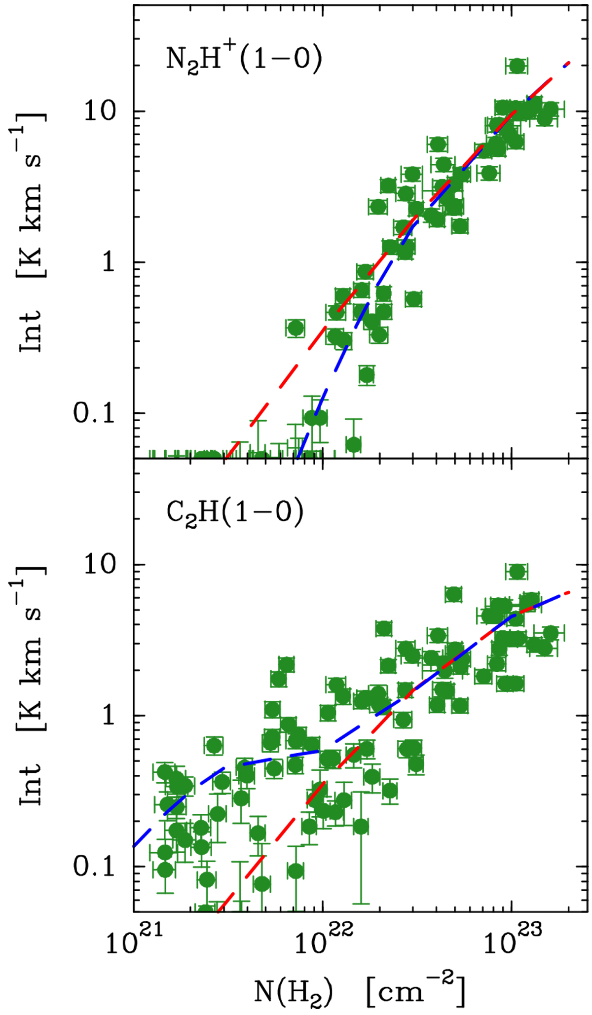
Comparison between observations and model results for two species that require special abundance profiles: N2 H+ (top) and C2H (bottom). In both panels, the green symbols represent the observed intensity, previously shown in Fig. 5. In the N2 H+ panel, the dashed red line represents a constant abundance model that fits the intensity at high column densities. The blue dashed line represents the best-fit model, and includes an internal abundance enhancement. In the C2 H panel, the dashed red line represents a model with no external enhancement, while the blue line represents the externally enhanced best-fit model.
Current usage metrics show cumulative count of Article Views (full-text article views including HTML views, PDF and ePub downloads, according to the available data) and Abstracts Views on Vision4Press platform.
Data correspond to usage on the plateform after 2015. The current usage metrics is available 48-96 hours after online publication and is updated daily on week days.
Initial download of the metrics may take a while.