Fig. 3.
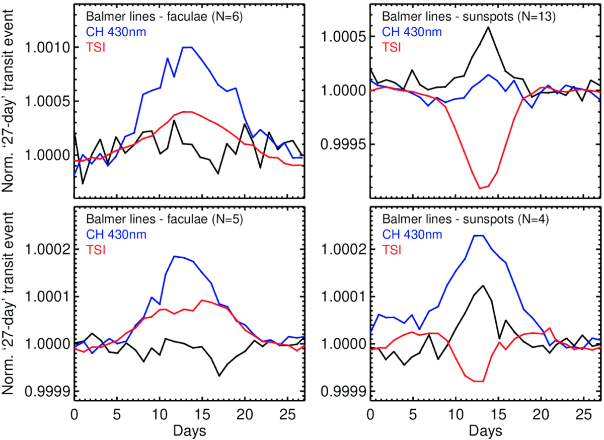
Facula-dominated and sunspot-dominated events in the OMI and TROPOMI line activity indices. The upper panels show the OMI data: the facula and active network-dominating case (left panel) in comparison to the sunspot-dominating case (right panel). The lower panels show the same for TROPOMI. In all panels, the shown values are normalized to a low-activity epoch and averaged over multiple events (N = 4–13 passages of active regions, as indicated in the upper-left corners of each panel). Black lines follow the Balmer activity indices, blue lines show the CH430nm indices, and red lines mark changes in TSI. We note the different Y scales in the OMI and TROPOMI plots.
Current usage metrics show cumulative count of Article Views (full-text article views including HTML views, PDF and ePub downloads, according to the available data) and Abstracts Views on Vision4Press platform.
Data correspond to usage on the plateform after 2015. The current usage metrics is available 48-96 hours after online publication and is updated daily on week days.
Initial download of the metrics may take a while.