Fig. 6.
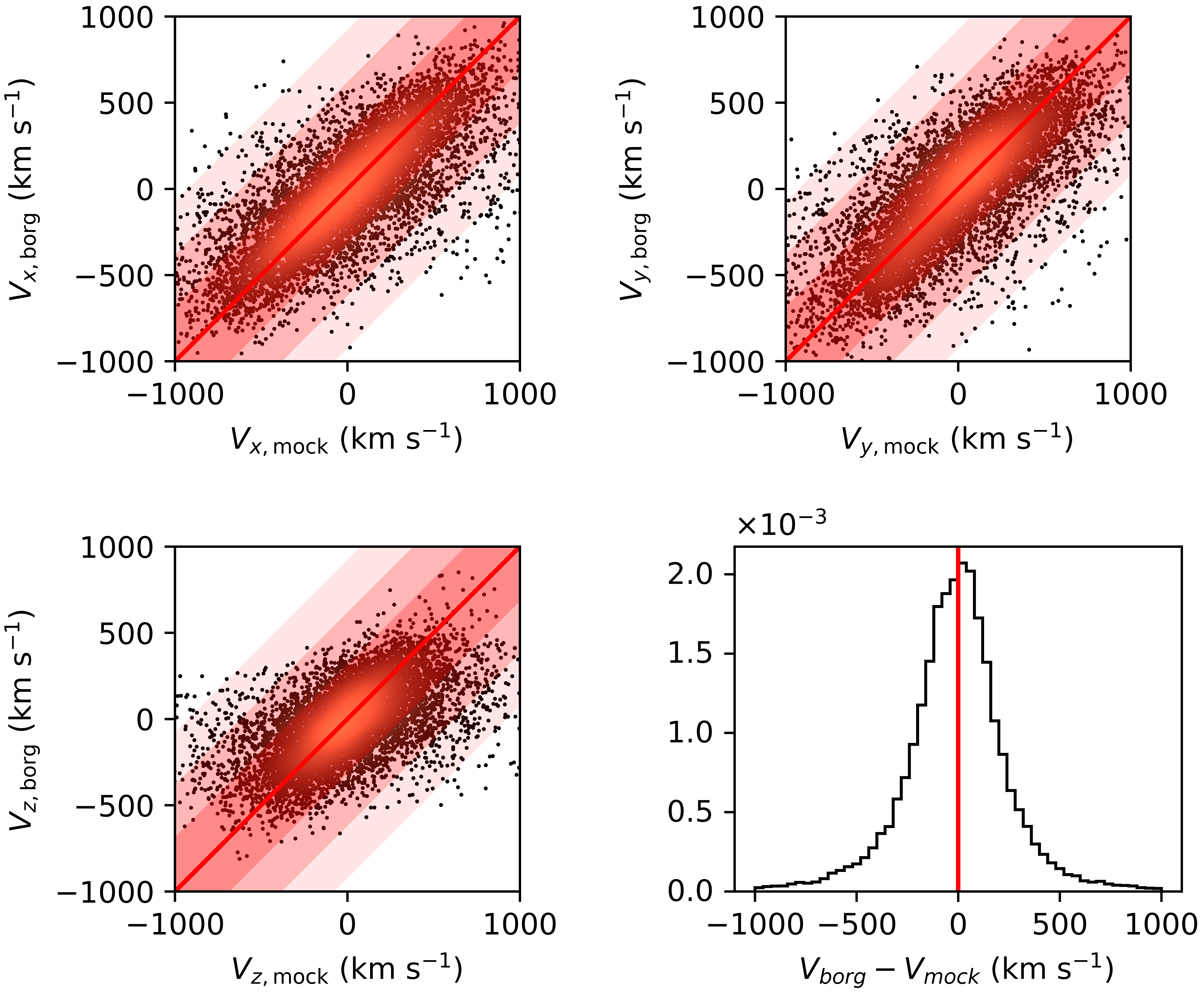
Components (xtop-left, ytop-right, zbottom left) of the velocities of the mock tracers as reconstructed from a single sample from BORG and compared to the ones provided by the original N-body simulation. The points are color-coded according to their local density in the scatter plot to allow better identification of the central part and the tails of the distribution. The diagonal red line is added for reference and to indicate unbiased velocity reconstruction. Lower-right panel: histogram of the difference between the BORG reconstructed velocities and the original velocities of the mock tracers for the three components.
Current usage metrics show cumulative count of Article Views (full-text article views including HTML views, PDF and ePub downloads, according to the available data) and Abstracts Views on Vision4Press platform.
Data correspond to usage on the plateform after 2015. The current usage metrics is available 48-96 hours after online publication and is updated daily on week days.
Initial download of the metrics may take a while.