Fig. 6
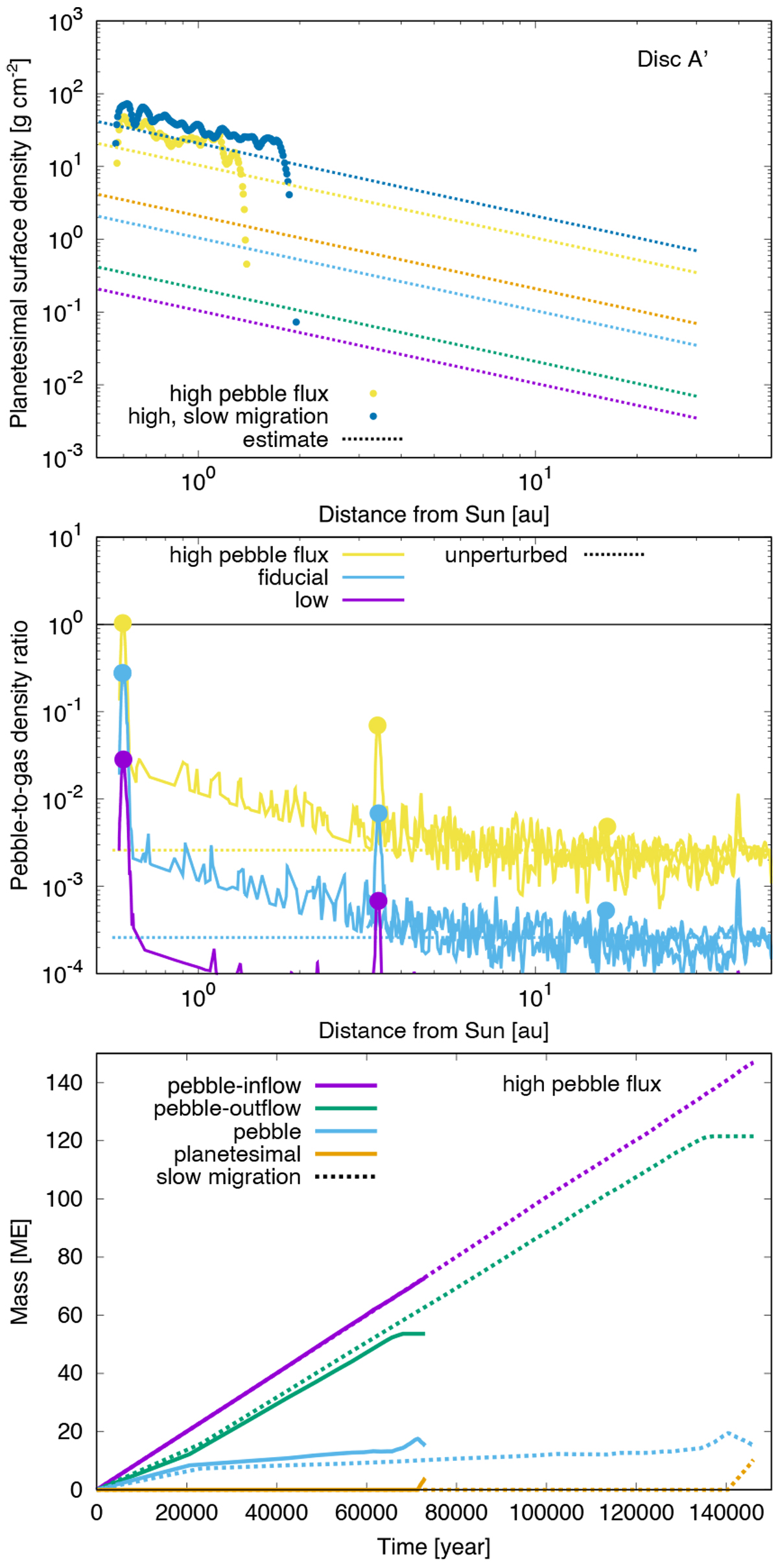
Upper two panels and lower panels: same as Figs. 5 and 4, respectively, but with a heavier gas disc, Disc A′. The yellow and blue plots in the upper two panels represent the profiles with the normal and half migration speed, respectively, with Ṁpeb = 10−3 ME yr−1. The orange plots indicate the profile with Ṁpeb = 10−4 ME yr−1 and the normal migration speed. The light blue and purple curves in the middle panel represent the profiles with Ṁpeb = 10−4 and 10−5 ME yr−1, respectively, with the normal migration speed. Lower panel: Ṁpeb = 10−3 ME yr−1.
Current usage metrics show cumulative count of Article Views (full-text article views including HTML views, PDF and ePub downloads, according to the available data) and Abstracts Views on Vision4Press platform.
Data correspond to usage on the plateform after 2015. The current usage metrics is available 48-96 hours after online publication and is updated daily on week days.
Initial download of the metrics may take a while.