Fig. 7
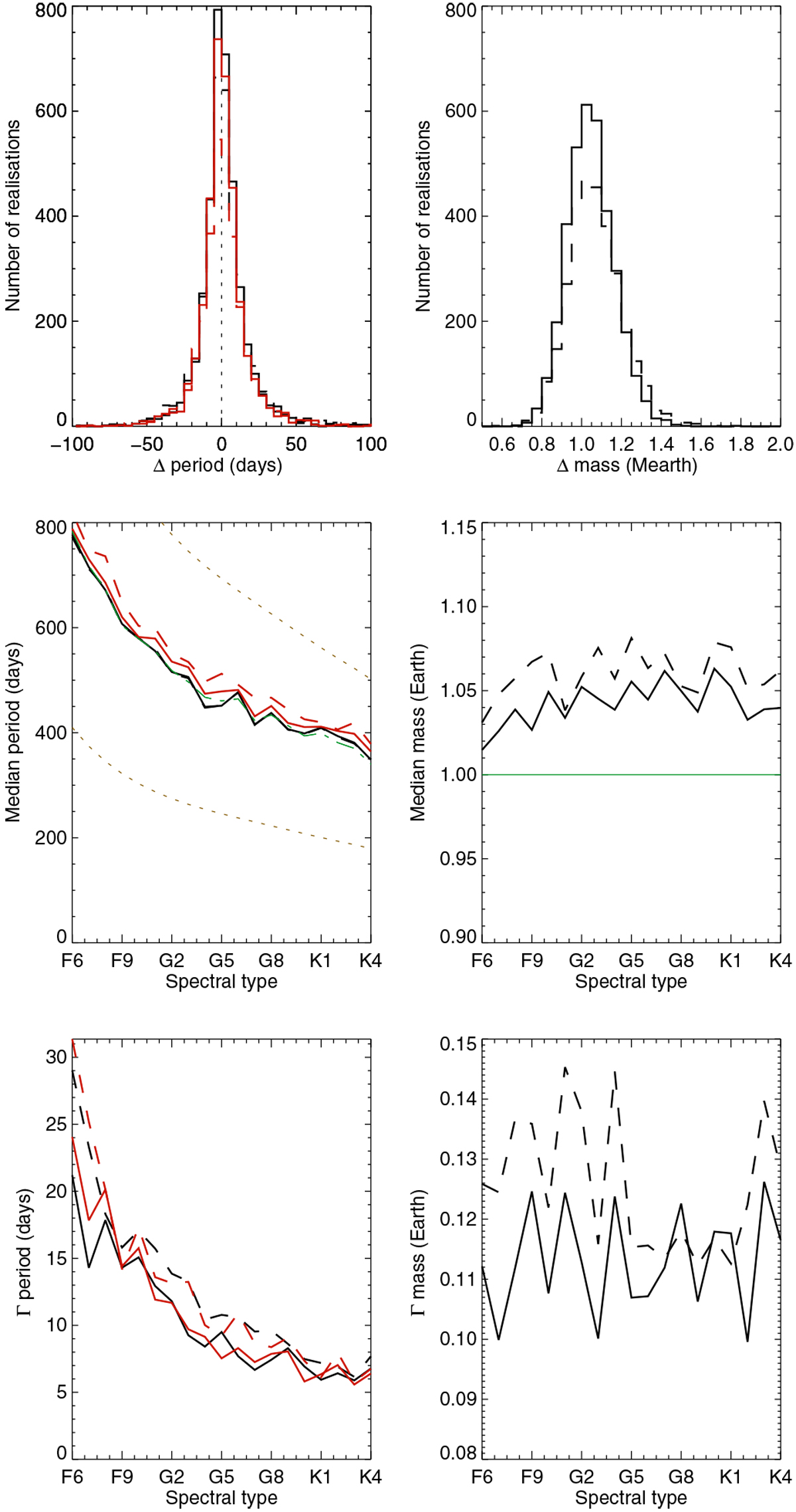
Upper panels: distribution of period (left) and mass (right) difference (between found and true period) for ΔTspot1 (solid line) and ΔTspot2 (dashed line) from blind tests A. The period plots are for the period corresponding to the highest peak in the periodogram (black) and fitted on the temporal series (red). Middle panels: median period and mass vs. spectral type. The true value is shown in green. The dotted lines in the period plot indicate the boundaries of the habitable zone we consider. Lower panels: distribution width (period difference and mass difference) vs. spectral type.
Current usage metrics show cumulative count of Article Views (full-text article views including HTML views, PDF and ePub downloads, according to the available data) and Abstracts Views on Vision4Press platform.
Data correspond to usage on the plateform after 2015. The current usage metrics is available 48-96 hours after online publication and is updated daily on week days.
Initial download of the metrics may take a while.