Fig. 10
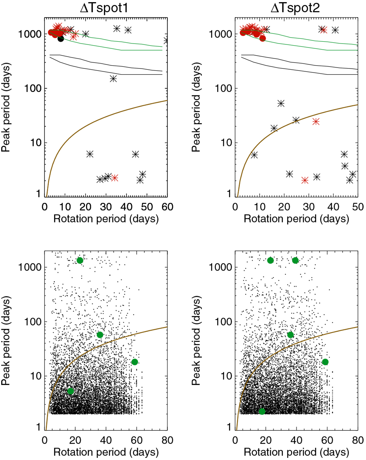
Period of the maximum peak in the periodogram vs. rotation rate for ΔTspot1 (left panels) and ΔTspot2 (right panels) and in two cases. First row: false positive level when no planet is injected (black) and when a planet is injected (red). Stars correspond to peaks outside the habitable zone and circles to peaks inside the habitable zone. The brown line indicates the position of the rotation rate. The two black curves represent the extent of the position of the inner side of the habitable zone (for different spectral types), and the green curves show the position of the outer side of the habitable zone. Second row: second highest peak in the periodogram, those in green indicate the peaks above the FAP. The brown line is similar to the first row.
Current usage metrics show cumulative count of Article Views (full-text article views including HTML views, PDF and ePub downloads, according to the available data) and Abstracts Views on Vision4Press platform.
Data correspond to usage on the plateform after 2015. The current usage metrics is available 48-96 hours after online publication and is updated daily on week days.
Initial download of the metrics may take a while.