Fig. 6.
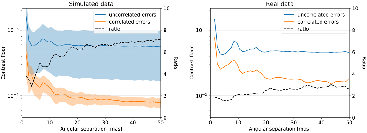
Left panel: contrast curve (i.e. azimuthal average of the best fit relative flux) for simulated data of an unresolved host star without any companion affected by correlated errors, computed with model fitting assuming uncorrelated data (blue curve) and correlated data (orange curve). Both curves show the mean contrast curve over 100 simulated data sets and the shaded region highlights its standard deviation. The dashed black line shows the ratio of the blue and the orange curve, representing the improvement (i.e. the factor by which the detection limits improve) when using our correlated error model instead of the classical uncorrelated one. Right panel: same, but for the real GRAVITY data introduced in Sect. 2.3.
Current usage metrics show cumulative count of Article Views (full-text article views including HTML views, PDF and ePub downloads, according to the available data) and Abstracts Views on Vision4Press platform.
Data correspond to usage on the plateform after 2015. The current usage metrics is available 48-96 hours after online publication and is updated daily on week days.
Initial download of the metrics may take a while.