Fig. 20
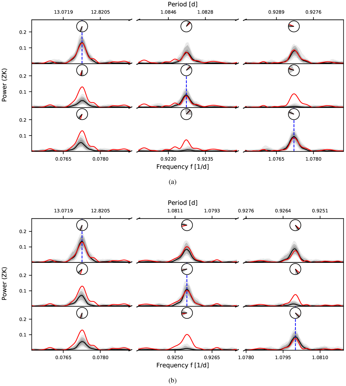
Alias tests for Lalande 21185. The top plot (a) shows simulations motivated by a sampling frequency of
![]() . The bottom plot (b) shows simulations motivated by a sampling frequency of fs2 = 1.0027 d−1. Each row in these plots corresponds to one set of simulations for which the frequency of the injected signal is indicated by a vertical dashed blue line. The first row shows simulations with a period of
12.95 d, and the second and third row show the simulations in which the first-order aliases of
12.95 d, regarding the investigated sampling frequency, were injected. Each column shows informative ranges of the periodograms based on the assumed sampling frequency and can be used to compare data and simulations. From 1000 simulated data sets, we show the median of the obtained periodograms (solid black line), the interquartile range, and the ranges of 90% and 99% (gray shades). The periodogram of the observed data is plotted with a solid red line. The angular mean of the phase and the standard deviation is shown in the clock diagrams (black line and gray shades) and can be compared to the phase ofthe signals in the observed periodogram (red line).
. The bottom plot (b) shows simulations motivated by a sampling frequency of fs2 = 1.0027 d−1. Each row in these plots corresponds to one set of simulations for which the frequency of the injected signal is indicated by a vertical dashed blue line. The first row shows simulations with a period of
12.95 d, and the second and third row show the simulations in which the first-order aliases of
12.95 d, regarding the investigated sampling frequency, were injected. Each column shows informative ranges of the periodograms based on the assumed sampling frequency and can be used to compare data and simulations. From 1000 simulated data sets, we show the median of the obtained periodograms (solid black line), the interquartile range, and the ranges of 90% and 99% (gray shades). The periodogram of the observed data is plotted with a solid red line. The angular mean of the phase and the standard deviation is shown in the clock diagrams (black line and gray shades) and can be compared to the phase ofthe signals in the observed periodogram (red line).
Current usage metrics show cumulative count of Article Views (full-text article views including HTML views, PDF and ePub downloads, according to the available data) and Abstracts Views on Vision4Press platform.
Data correspond to usage on the plateform after 2015. The current usage metrics is available 48-96 hours after online publication and is updated daily on week days.
Initial download of the metrics may take a while.