Fig. 9
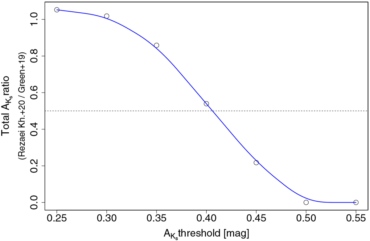
Ratio of the total extinctions between our reconstructed extinction map and that of Green et al. (2019) as a function of the extinction threshold used. For each extinction threshold, we calculate the total amount of extinction above that value for each map and plot the ratio between the two (the Y axis). This is a proxy of the total mass of the cloud within that threshold. The blue line is a curve fit to the points using an X-Spline with shape = 0.5 (Blanc & Schlick 1998). The dashed line indicates the total extinction ratio of 0.5.
Current usage metrics show cumulative count of Article Views (full-text article views including HTML views, PDF and ePub downloads, according to the available data) and Abstracts Views on Vision4Press platform.
Data correspond to usage on the plateform after 2015. The current usage metrics is available 48-96 hours after online publication and is updated daily on week days.
Initial download of the metrics may take a while.