Fig. 8
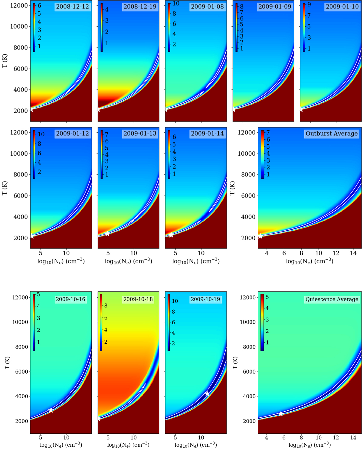
Result of Saha’s equation analysis for the lines with disk-like profiles and low transition probabilities for the observationstaken during the outburst phase (upper panels) and for the same lines as observed during quiescence (lower row). The panels show the data corresponding to individual days in chronological order; last panel: result of fitting the average spectrum. The color scheme reveals the relative variations in the line intensity ratio for each combination of temperature and electron density (such that 0.1 would correspond to 10% average deviations). The white contour indicates the regions for which the relative variations of the line ratio are up to 3 times the minimum value observed, which is considered as our best-fit region; a white star denotes the best fit.
Current usage metrics show cumulative count of Article Views (full-text article views including HTML views, PDF and ePub downloads, according to the available data) and Abstracts Views on Vision4Press platform.
Data correspond to usage on the plateform after 2015. The current usage metrics is available 48-96 hours after online publication and is updated daily on week days.
Initial download of the metrics may take a while.