Fig. 15.
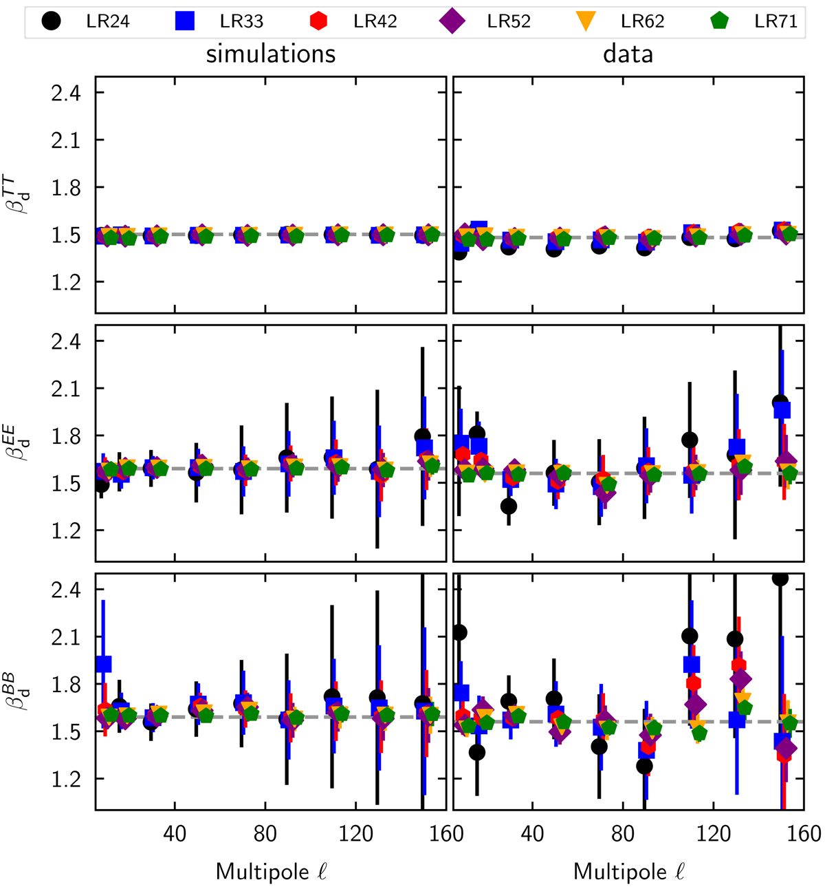
Comparison of spectral indices of dust polarized emission and total intensity. The spectral indices are derived from the 353-to-217 GHz colour ratio. Plots to the left show the results obtained from our simulated maps, and the ones to the right are from the Planck data. Distinct symbols are used to represent each of the six sky regions, as in Fig. 10. For the simulations, the dashed lines represent the input dust spectral indices (![]() ,
, ![]() ). For the data, the dashed lines represent the mean measured dust spectral indices (
). For the data, the dashed lines represent the mean measured dust spectral indices (![]() ,
, ![]() ).
).
Current usage metrics show cumulative count of Article Views (full-text article views including HTML views, PDF and ePub downloads, according to the available data) and Abstracts Views on Vision4Press platform.
Data correspond to usage on the plateform after 2015. The current usage metrics is available 48-96 hours after online publication and is updated daily on week days.
Initial download of the metrics may take a while.