Fig. 4
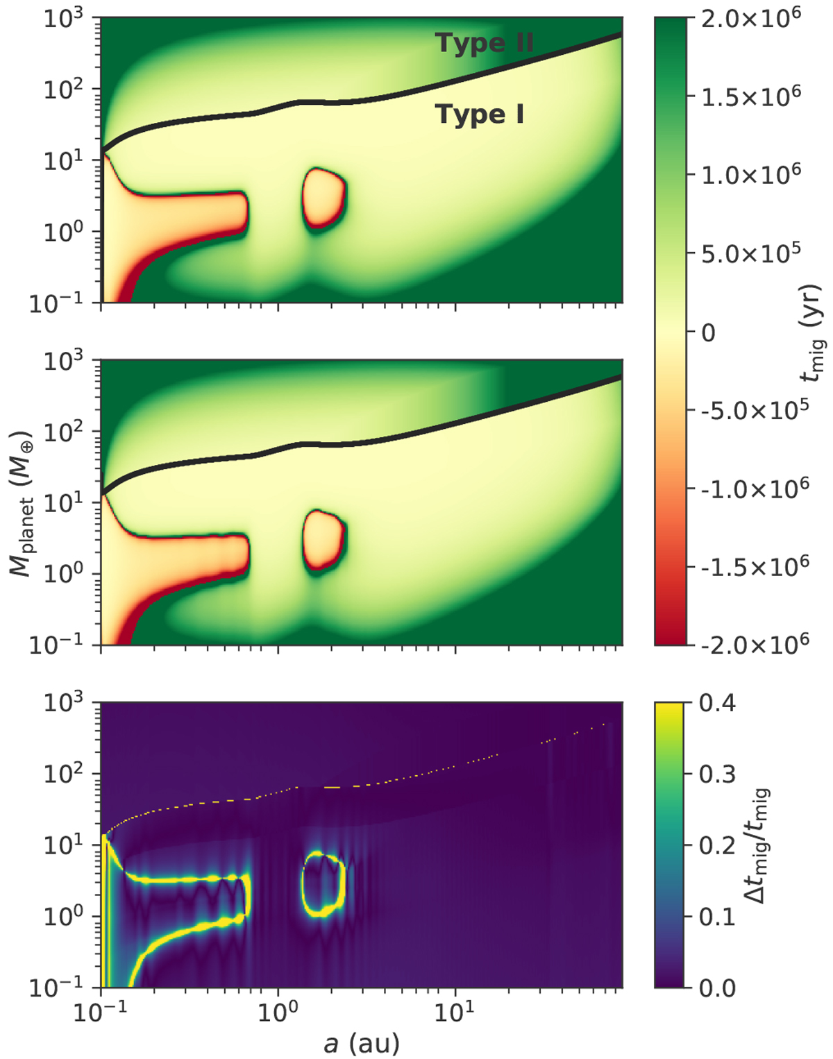
Map highlighting the different migration regimes after 0.1 Myr of disc evolution. Upper two plots: red zones show the outward migration regions. The type I and type II migration regimes are distinguished by the solid black line: above it the planets undergo type II migration and below it they undergo type I migration. These two plots are computed with the planetesimal accretion code (top plot) and the pebble accretion code (middle plot) respectively. Third and bottom plot: relative difference we observe between the top two plots. The darker the outcome, the more similar they are.
Current usage metrics show cumulative count of Article Views (full-text article views including HTML views, PDF and ePub downloads, according to the available data) and Abstracts Views on Vision4Press platform.
Data correspond to usage on the plateform after 2015. The current usage metrics is available 48-96 hours after online publication and is updated daily on week days.
Initial download of the metrics may take a while.