Fig. 7.
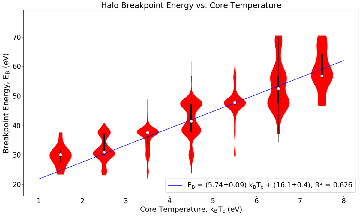
“Violin plot” of halo breakpoint energy against core temperature. The blue line shows the line of best fit. The white dots indicate the median of breakpoint energies and the thick black lines show the inter-quartile ranges (IQR). We plot the thin black lines to display which breakpoint energies are outliers. They span from Q3 + 1.5 × IQR to Q1 − 1.5 × IQR, where Q3 and Q1 are the upper and lower quartiles, respectively. The horizontal width of the red regions represents the density of data points at that given breakpoint energy.
Current usage metrics show cumulative count of Article Views (full-text article views including HTML views, PDF and ePub downloads, according to the available data) and Abstracts Views on Vision4Press platform.
Data correspond to usage on the plateform after 2015. The current usage metrics is available 48-96 hours after online publication and is updated daily on week days.
Initial download of the metrics may take a while.