Fig. 8.
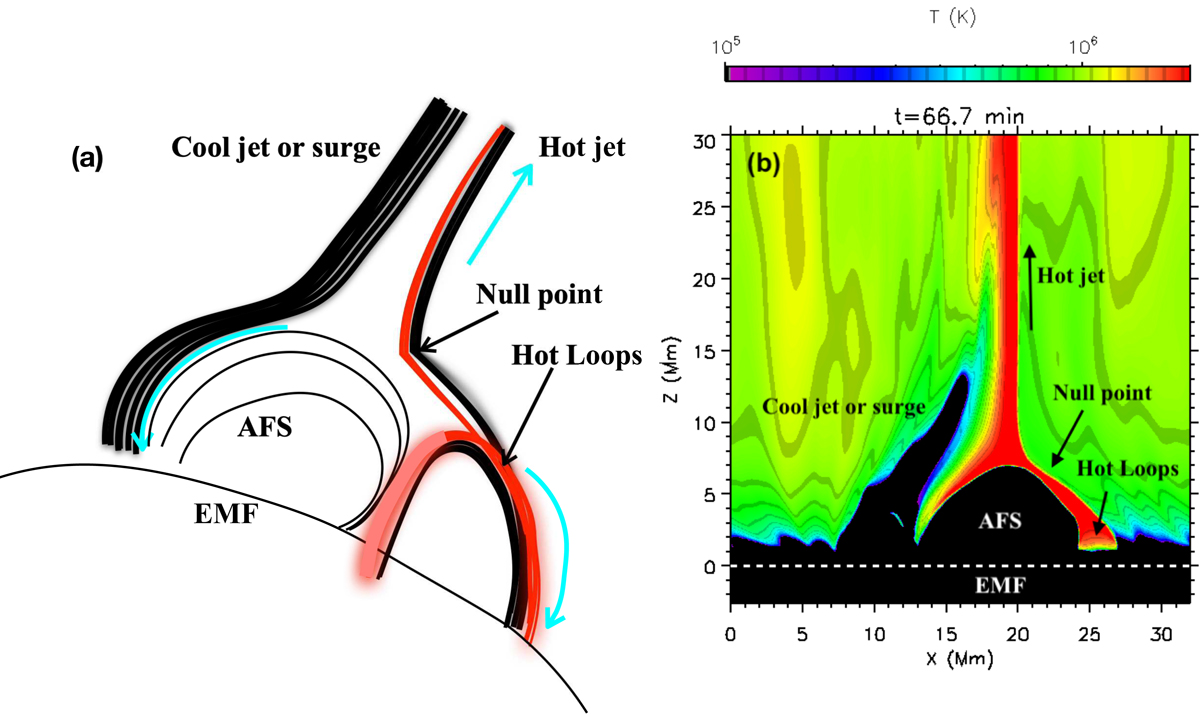
Panel a: schematic view of the 3D jet derived from Moreno-Insertis et al. (2008), showing the location of the null-point, the cool surge, and the hot loops next to the AFS. The cyan arrows indicate the flow direction. The red lines indicate hot plasma. The black lines are magnetic field lines. Panel b: temperature map of one of the numerical experiments by Nóbrega-Siverio et al. (2017, 2018) showing the hot jet and the cool surge (an animation of this panel is available online). In both panels, the region of the convection zone where the new magnetic flux has emerged (EMF) is also indicated.
Current usage metrics show cumulative count of Article Views (full-text article views including HTML views, PDF and ePub downloads, according to the available data) and Abstracts Views on Vision4Press platform.
Data correspond to usage on the plateform after 2015. The current usage metrics is available 48-96 hours after online publication and is updated daily on week days.
Initial download of the metrics may take a while.