Fig. 7.
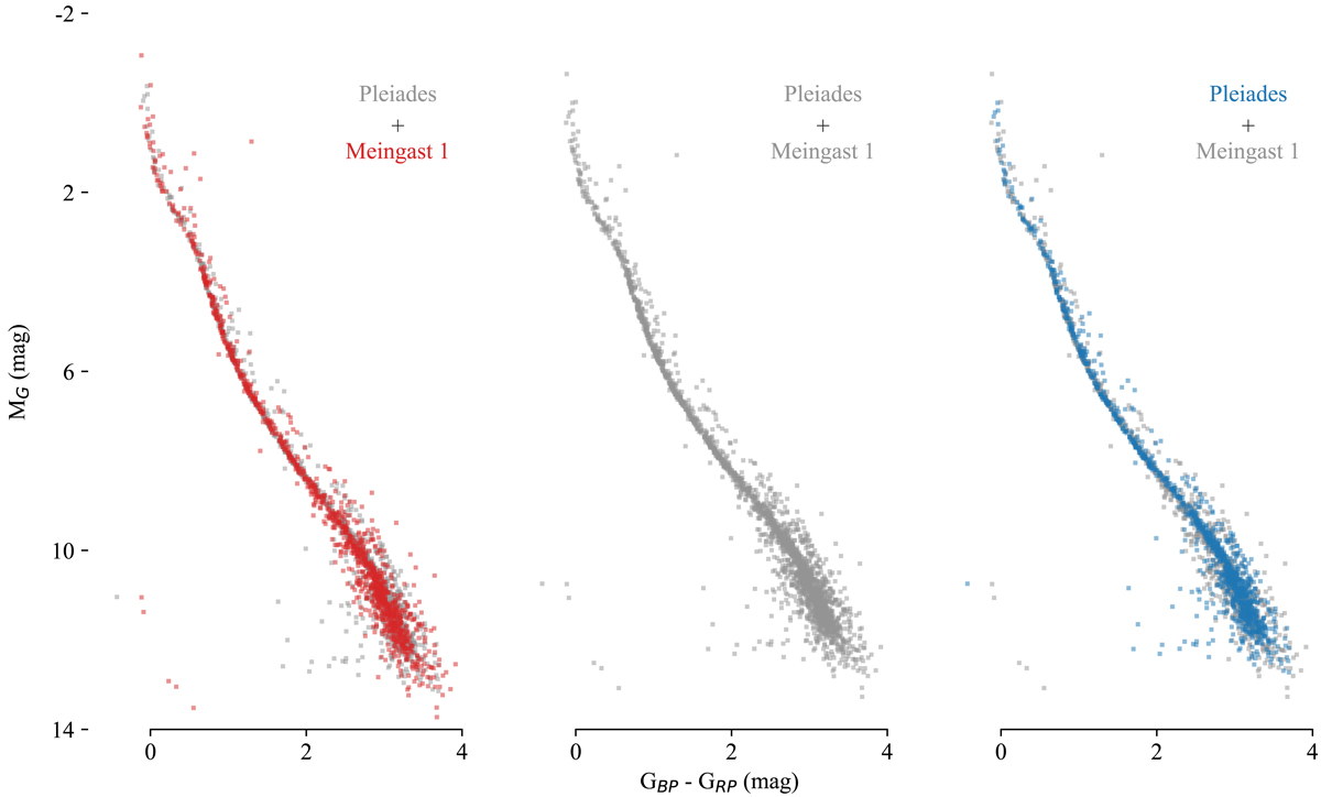
Comparison between predicted stream members and the Pleiades member selection. The three panels show the same two data sets plotted on top of each other and highlighted by different colors. In the left plot, the predicted stream members are highlighted in red, while the Pleiades are kept in gray. The center plot displays both stellar associations in gray. The right plot displays the Pleiades member selection in blue on top of the predicted stellar stream in gray. We chose the stability cut to match the number of sources in the Pleiades sample in order to generate a fair comparison. The CMD distributions of the Pleiades and the predicted stream matches almost perfectly.
Current usage metrics show cumulative count of Article Views (full-text article views including HTML views, PDF and ePub downloads, according to the available data) and Abstracts Views on Vision4Press platform.
Data correspond to usage on the plateform after 2015. The current usage metrics is available 48-96 hours after online publication and is updated daily on week days.
Initial download of the metrics may take a while.