Fig. 11.
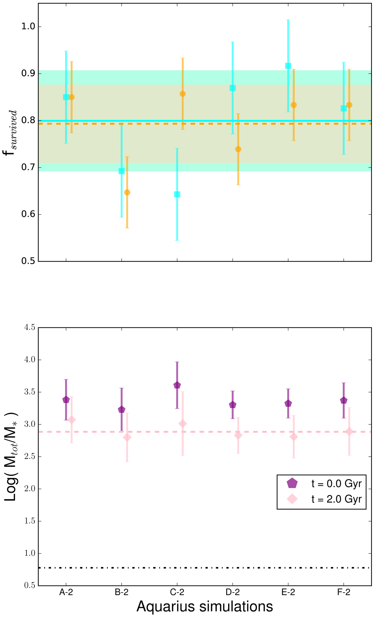
Top panel: fraction of surviving satellites, with 10% of their initial mass adopted as the threshold to determine their survival. Colour-coding as in Fig. 3. The orange and cyan error bars are the rms scatter for our set of simulations and for the MJ16 simulations, respectively. Bottom panel: logarithm of the ratio of total mass to stellar mass in the satellites in the Aq-A2 to Aq-F2 simulations, log(Mtot/M*), for the initial and final snapshot. Purple pentagons are the average of each corresponding simulation for the initial data at t = 0 Gyr; pink diamonds are instead for the final data at t = 2 Gyr. The purple and pink error bars are the rms scatter for all the satellites in each corresponding simulation (initial and final snapshot, respectively). The dot-dashed black line is the density ratio Ωm/Ωbar of all matter to baryonic matter. The pink dashed line represents the best fit for the final ratios (Mtot/M*)best. Only the satellites that survive the stripping process are employed to calculate the average and the standard deviation in each simulation.
Current usage metrics show cumulative count of Article Views (full-text article views including HTML views, PDF and ePub downloads, according to the available data) and Abstracts Views on Vision4Press platform.
Data correspond to usage on the plateform after 2015. The current usage metrics is available 48-96 hours after online publication and is updated daily on week days.
Initial download of the metrics may take a while.