Fig. 8.
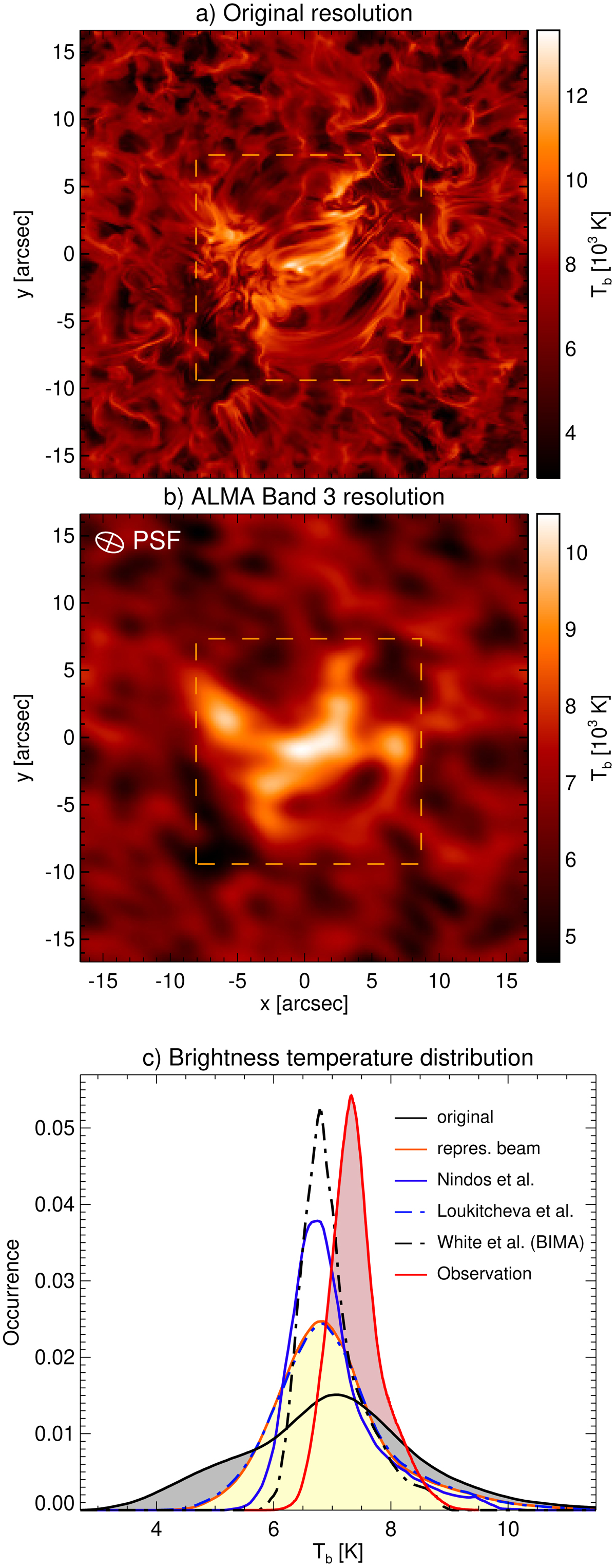
Selected synthetic brightness temperature map (Bifrost/ART) for the average Band 3 frequency (100 GHz). The enhanced network region is shown with a yellow dashed rectangle. (a) The original millimetre map averaged over the frequencies covered by the solar ALMA observations in Band 3. (b) The millimetre map after applying the PSF (see upper left corner) corresponding to the representative synthetic beam for the observation presented here. (c) The brightness temperature distributions for the original map (black solid line, grey area) and after applying different PSFs: representative beam as in panel b (orange solid, yellow area), Nindos et al. (2018; blue solid), Loukitcheva et al. (2019; blue dot-dashed), and White et al. (2006; BIMA, black dot-dashed). The distribution for observed Band 3 temperatures is plotted as a red line and red shaded area (all pixels, see Fig. 4b).
Current usage metrics show cumulative count of Article Views (full-text article views including HTML views, PDF and ePub downloads, according to the available data) and Abstracts Views on Vision4Press platform.
Data correspond to usage on the plateform after 2015. The current usage metrics is available 48-96 hours after online publication and is updated daily on week days.
Initial download of the metrics may take a while.